Lesson 3 - Technical Analysis - The Basics
(To obtain this as a PDF document click here)
Types of Charts
Technical analysis is the use of graphs (also called charts), based on historical information, which allows the user to analyse past share price performance and make assumptions about the future trend in prices. This is one of the most powerful tools of the stock market investor. Using technical analysis, the investor can derive buy and sell signals from a chart. It allows the investor to buy a share when it is low in price and sell when it is high.
There are three main types of chart plots, namely Line charts, Bar charts (and/or Candlestick charts), and Point and Figure charts. Each has its own particular use. There are also many other chart “types” derived from these.
Line Chart
(click image to enlargen)
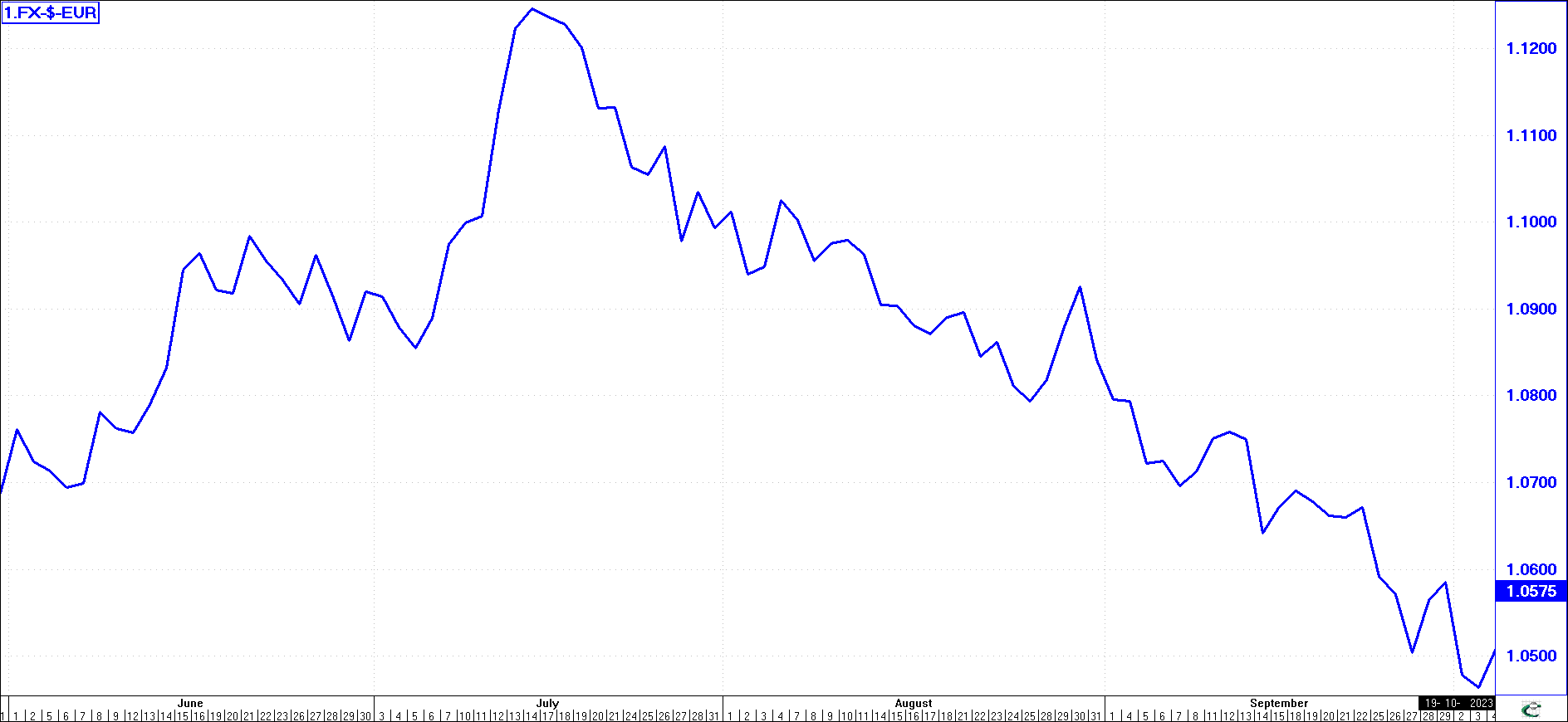
The line chart in this illustration is just what its name suggests; a line linking a series of graph plotting points (of the Euro to US dollar exchange rate) which might represent daily, weekly, or monthly prices. These are the easiest to understand. Although not shown on this chart, they can be used to plot price movements in association with the moving averages of the prices. In such instances, when a moving average line intersects the line representing price movement, buy and sell signals are generally given. Line graphs are also used for plotting various types of indicators (including Relative Strength charts).
Bar Charts
(click image to enlargen)
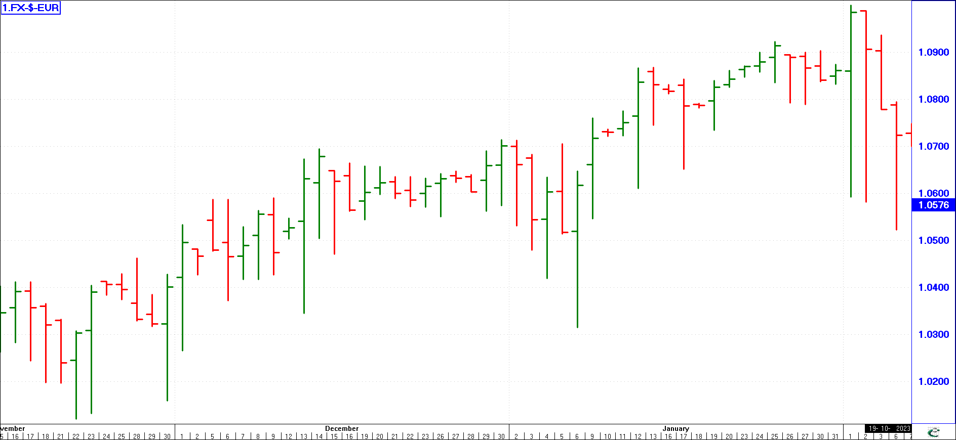
These charts may likewise be plotted daily, weekly, or monthly, but instead of depicting joined plotting points, they depict the maximum and minimum prices attained each day, plus the closing price. Depicted as vertical lines, each bar stands on its own and is not connected to the previous plot.
The advantage of a bar chart is that it can highlight identifiable patterns such as movements in channels or trends. It can highlight the existence of both buying support and resistance lines and help the user in identifying cyclical changes of market direction. The illustration shows the bars (high/low) together with a small horizontal tag which shows the close.
Traditionally, the Bar chart should also show the Opening price (as this example does). This would be shown as a small horizontal tag to the left of the vertical line. The Close is the small horizontal tag to the right of the High/Low line. For some items, the Opening price is not available electronically and therefore is not used. If necessary, an approximation would be to use the previous day's close as today’s open; however, this does not strictly hold true!
Candlesticks
(click image to enlargen)
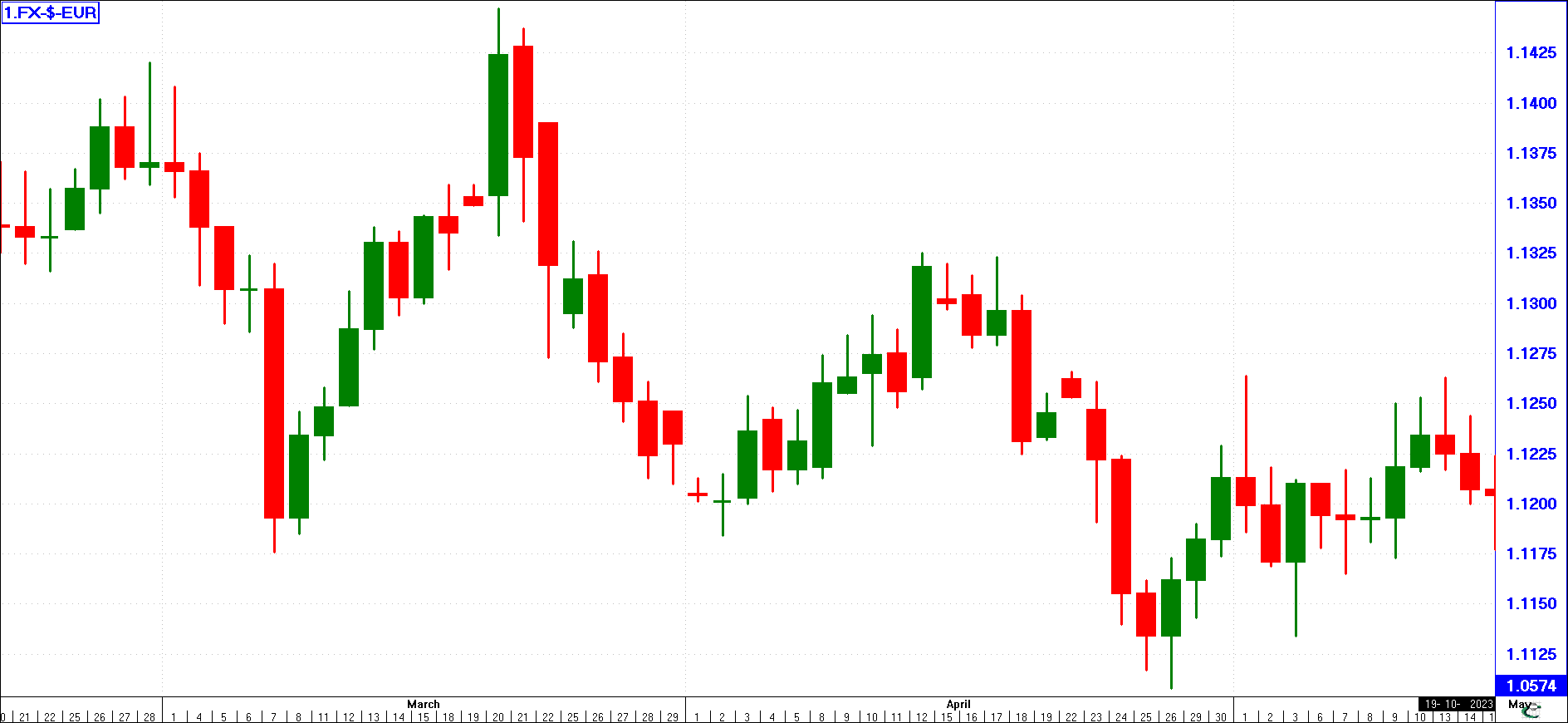
This chart type is like a modified Bar chart since it displays Open, High, Low, and Close data. Traditionally, a Bar chart does not tell you if the market closed higher than it opened or if it closed lower than it opened. With a Candlestick chart, you can immediately see the Up days (Closed higher than we opened) as they are open/blank/empty boxes (or in this example filled with a colour, Green for Up days and Red for Down days). Conversely, the Down days (Closed lower than we opened) are filled/coloured boxes.
You will have noted from the Bar Chart example, that PrimeCharts charting software can also display Bar Charts with different colours to highlight the Up and Down days.
Point & Figure Charts
(click image to enlargen)
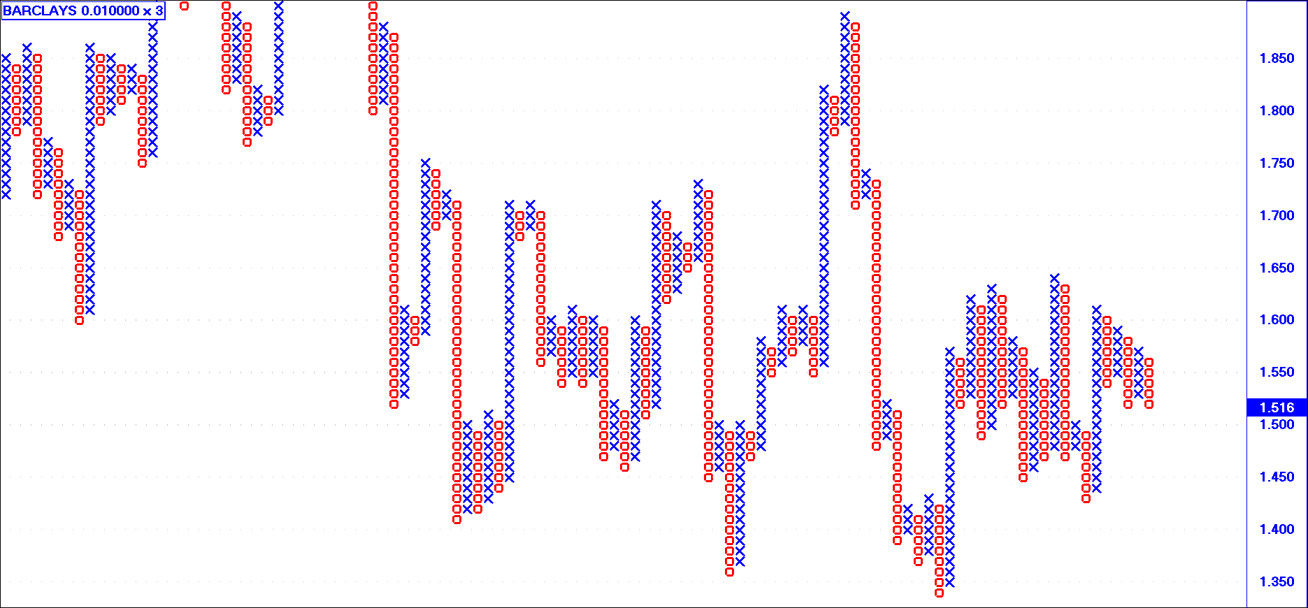
These charts (or P & F charts as they are known) differ from both line and bar charts in that they do not have a horizontal time scale. P & F charts depict price movements only. They can be used to identify both patterns and trends.
P & F charts employ "X's" to portray rising price’s column and "O's" to portray declining prices. A line of X's is drawn vertically depicting rising prices, and there is no attempt to start another vertical line of O's until such time as a downward price reversal occurs. In the illustration above, the "three-point reversal" is employed. Simply explained, the price will have to fall through three plotting points before a price trend reversal occurs.
Identifying & Using Trends
One of the most remarkable and consistent features of stock market charts is the tendency of prices to move in a particular direction - up, down, or sideways - for a prolonged period. We call this movement a trend. Trend lines can be superimposed upon any chart to emphasize the direction of the market. As a basic rule, Trend lines must join three points before one attempts to extend them. The more points that can be joined, the stronger the trend!
Trend lines work very well with bar charts but can be used with success in line charts and point and figure charts (Experience has shown that when using P & F charts, Trend lines appear to work best on three-box reversal charts).
There are a few market clichés that are worth remembering:
| • |
The trend is your friend |
| • |
Don't buck the trend |
It follows that once you establish the direction or trend of the market, you should "stay with your friend." If you "buck the trend" you probably will lose money as you go against the market’s direction.
We draw trend lines on charts to help us see more clearly what the trend is. Trend lines do not dictate to the market which direction to go; rather, trend lines only identify what the market is already doing. The fact that the market (or a share) may consistently rise to a certain level time and time again, only to fall back, is due to the fact that the market is based on the emotions of humans. Given the same situation, they react the same way each time. As we extrapolate trend lines, it helps us to see the levels that at some stage in the future these same human emotions will cause investors to stop/start buying. Trend lines thus help to forewarn you of potential market reversals.
Three Trend Directions
(click image to enlargen)
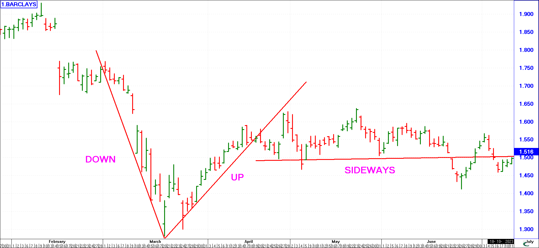
There are only three ways a market can trend, as shown in the example here. Markets will either trend down or trend up. When doing neither, they trend sideways.
Make it a rule to invest or trade with the trend, not against it. We will now consider these three market phases in more detail:
Upward (Bull) Trend
This is an upward trend in price. There may be temporary dips in the trend, but the overall trend is up. The line is always drawn connecting the lowest points. A “bull” is therefore an investor who anticipates that prices will go up. As long as the price does not fall through the trend line, the trend remains up and it is usually safe to consider investing (using methods to be discussed later to provide the exact timing).
Downward (Bear) Trend
A major downward trend in the share price. Although there may be temporary rises in price, the major trend is down. The trend line is always drawn connecting the highest points. A “bear” is therefore someone who anticipates that prices will fall. Except for those markets (Bond, futures, etc.) where one can profit by selling into a falling market, the share investor will want to remain out of the market during a Bear trend. He will spend his time carefully looking for that moment of reversal when the downward trend could change into an upward run.
Sideways Trend (Congestion)
This is when a share price bounces around within a certain limited range without any clear signal of the direction it will take in the future. Trend lines are usually drawn across the high as well as the low points for a sideways trend, as connecting the low points is usual if it occurs following a prolonged rise, and the high points following a long decline. Some analysts like to draw an analogy between trend formation and the “Law of Inertia” described in physics textbooks, which states that an object in motion in a particular direction will continue in that direction until a force is encountered to change it. This analogy is quite apt, so it may be instructive to identify those forces that initiate the trend in the first place, keep it going, and finally cause it to reverse.
No Trend Lasts Forever
(click image to enlargen)
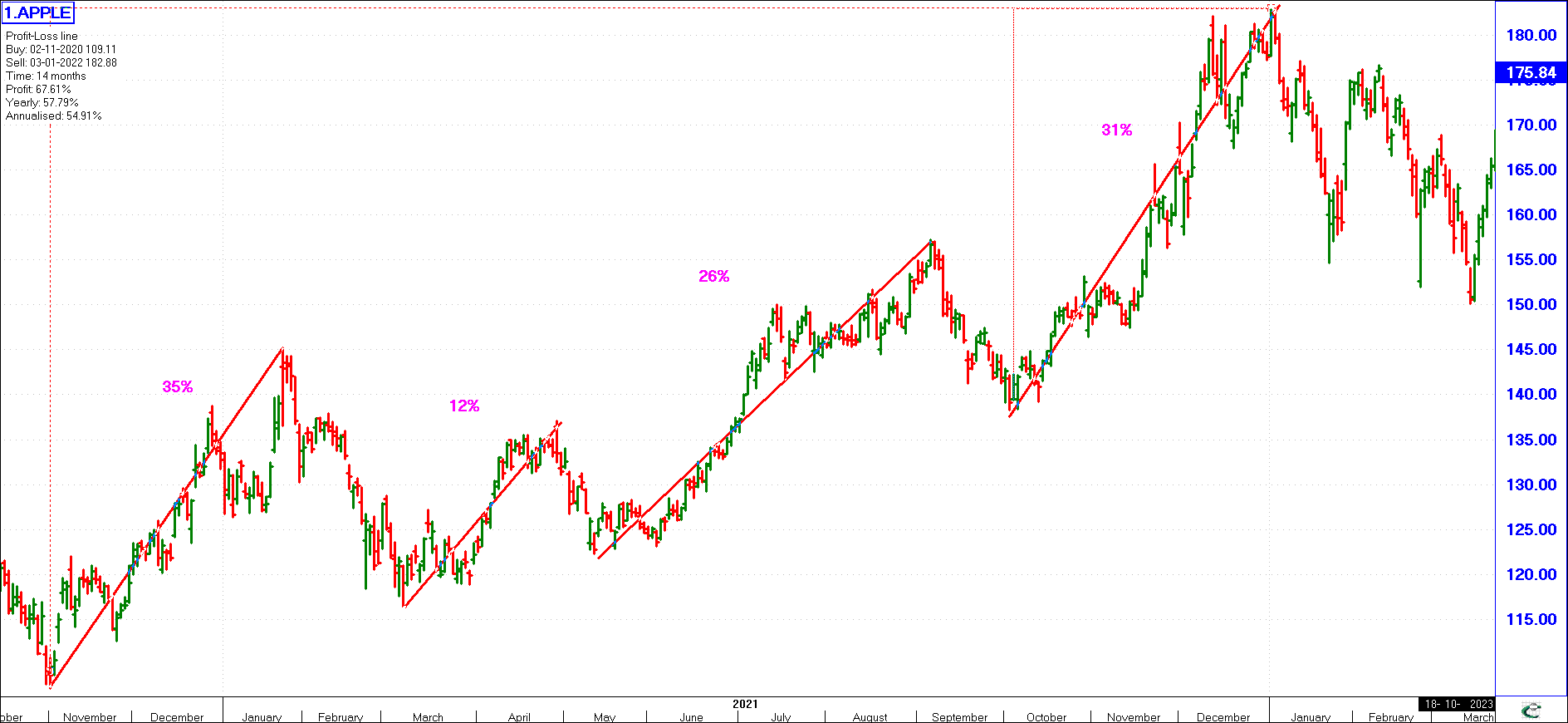
Remember, no trend lasts forever, even though sideways movement may account for almost 70% or more of a typical share's movement. Even long bull or bear runs will usually consist of large percentages of small sideways movement. The actual major percentage moves will usually be confined to just a few days. Take the example of APPLE shown here - From November to December of the next year, a total of 14 months, it rose 67%. However, it rose 35% in just the first 3 months and 31% in the last 3 months. During the remaining 8 months in between, it moved up and down (sideways), losing 20%, rising 12%, dropping 10%, rising 26%, dropping 12%, and so on.
In a general sideways market, a break out on any side will give a buy or sell signal. The longer a sideways trend is maintained, the more forceful the breakout will be when it occurs.
Primary Trend
(click image to enlargen)
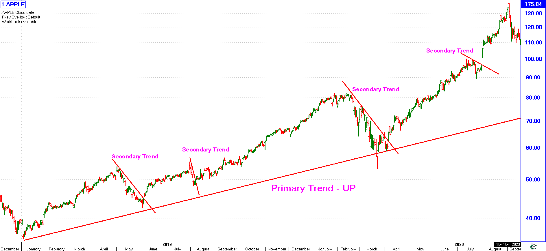
The major trend in the market, be it up or down.
This trend usually lasts longer than 18 months. As shown in the example here with DiData, starting well before 1996 and continuing past 1998, the price continued to rise. The primary trend in DiData during this period was thus up.
Secondary Trend
This is a minor trend that occurs during a primary trend, be it up or down. Let us say the primary trend is a bull trend (as in the example of DiData above), but the share price drops for three months before resuming its bullish trend (as shown in early 1997 and mid-1998), this is a secondary bear trend. At times, the rate of rise (in a primary up-trend) may vary. These would be secondary trends. Secondary trends can be in the same direction or contrary to the Primary Trend.
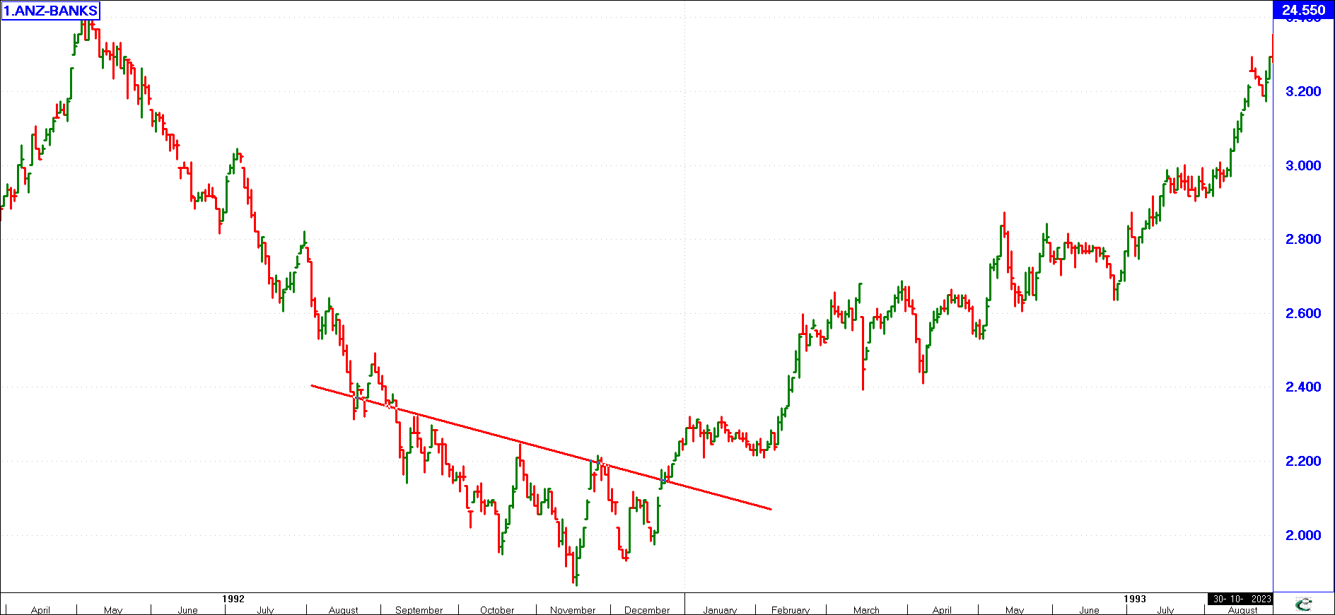
Support Level
(click image to enlargen)
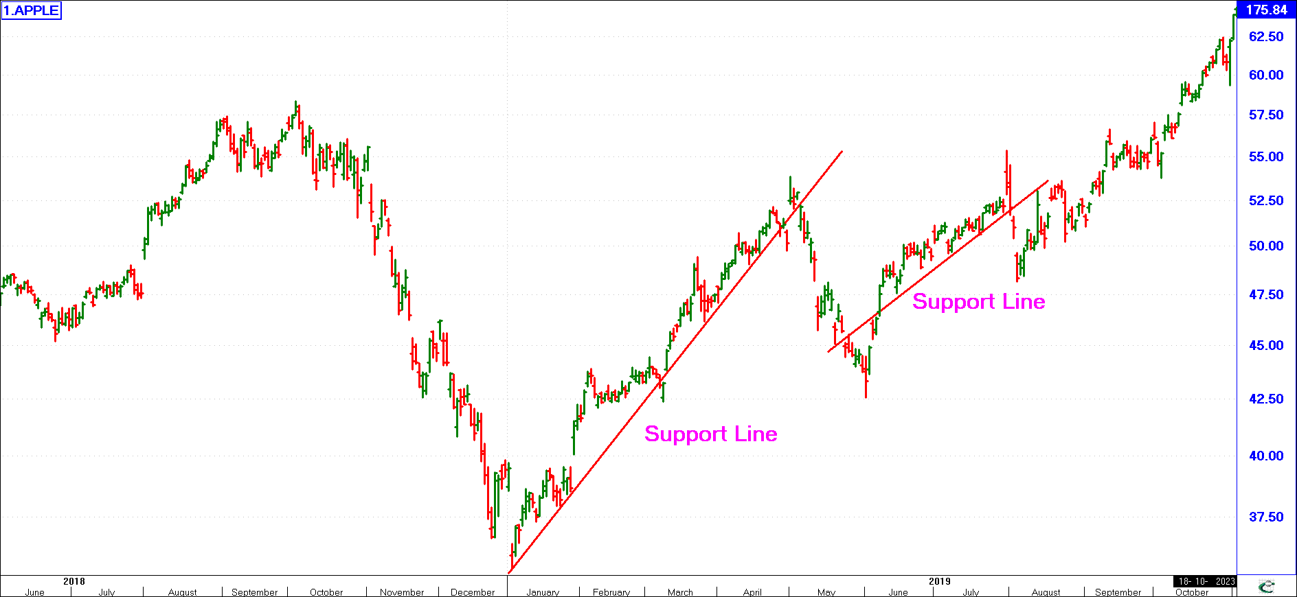
This is a level where there is considerable buying pressure, usually from large institutional investors, which “supports” the price. A trend line drawn across the bottom of the trend is called a “Support Line”. Support will be in the direction of the trend, and as shown above can be descending or ascending.
A breakout down through a support level usually leads to further selling of the shares, depressing the price even further. If rising support is breached, usually this signals a change from a bull to bear market.
Resistance Level
(click image to enlargen)
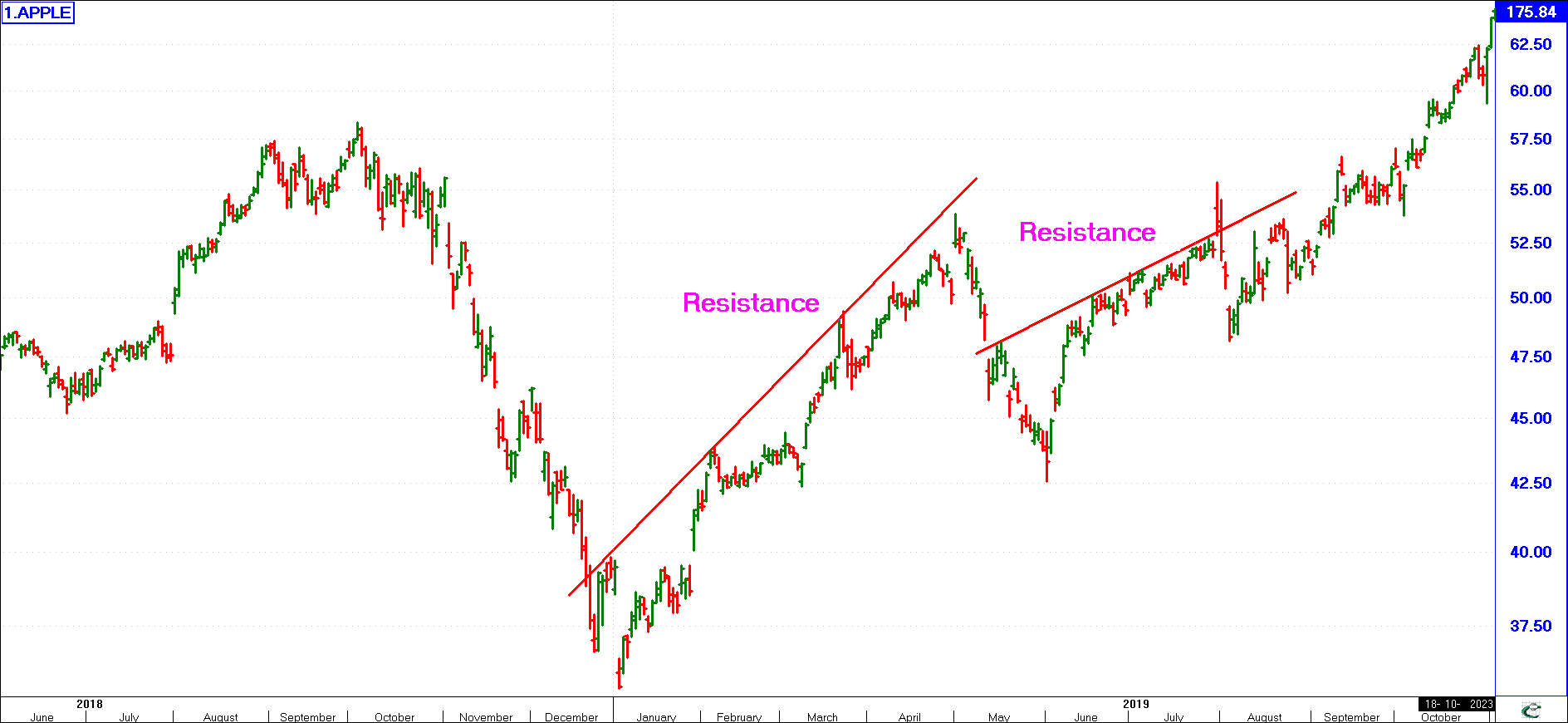
This is the opposite of a support level. A trend line drawn across the tops of the trend is called a “Resistance Line”. As with Support, Resistance will be in the direction of the trend and as shown here, can be descending or ascending.
A share in a bull trend may seem unable to penetrate a certain level. This is because some large investors have left automatic selling orders with their brokers if the share reaches a certain price, at which point they are happy to cash in their profits. Usually, an upward break out through a resistance level (irrespective of it being ascending or descending resistance) is a buy signal, and the share may rise very quickly upwards as investors perceive an opportunity to make a quick profit.
Often a share will trade between a support and a resistance level. If the support line is parallel to the resistance line, it is known as a channel.
Channels
(click image to enlargen)
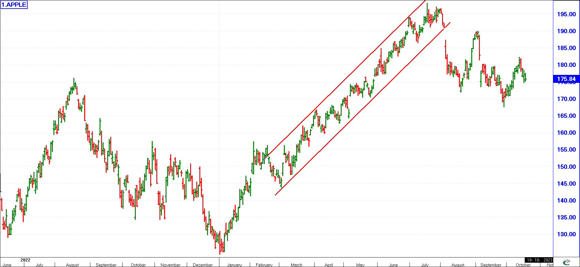
A common feature of well-established trends on a chart is the existence of channels. A channel may be regarded as a kind of tube or duct within which the share price fluctuates, “bouncing” from wall to wall. The space between the two lines making up the channel is often called the trading range. In the example above, the share moved in the shown channel for just a few weeks. The channel will identify the current trend and hence channels help identify either up, down or sideways movement.
(click image to enlargen)
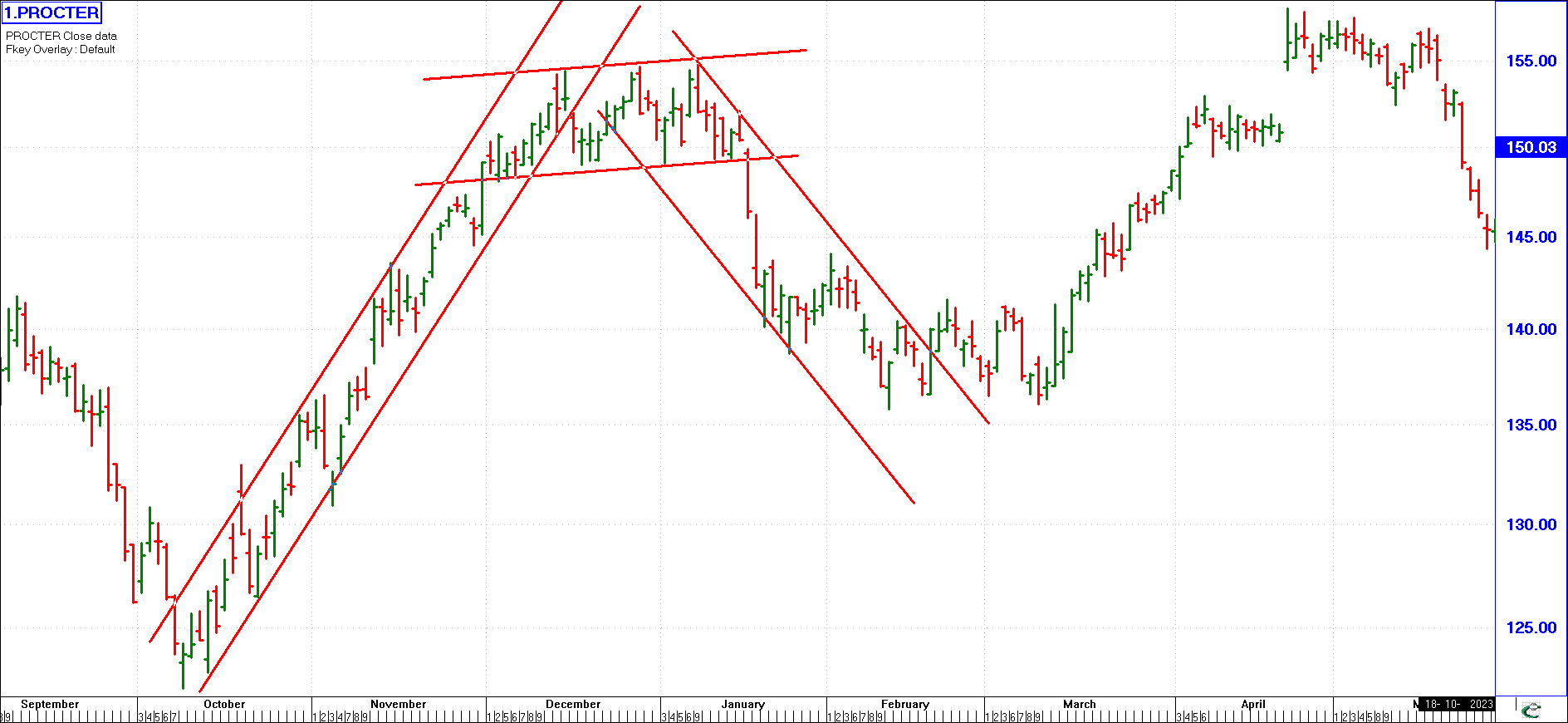
Looking at the example here we see initially an upward trend. This share moved in an up channel until early December. When the share broke out of this up trend, it moved sideways for December and January, again in a very definite channel. When it broke out of this sideways trend in late January, the share went into a very steep downward trend, again in a very easily discernable channel.
Do not expect to have a share constantly move in channel after channel as it changes its trend as shown in this example. Often a share will trend in a given direction without any easily discernable channel.
However, once a channel is identified, you will know that the longer the trend has been in existence (and the price has moved in the channel), the more significant the breakout from the channel will be. The astute investor watches any share that he has identified as moving in a channel closely since he knows that if it breaks out to the upside, a big move (and profit) will almost always occur.
Pull back Effect
(click image to enlargen)
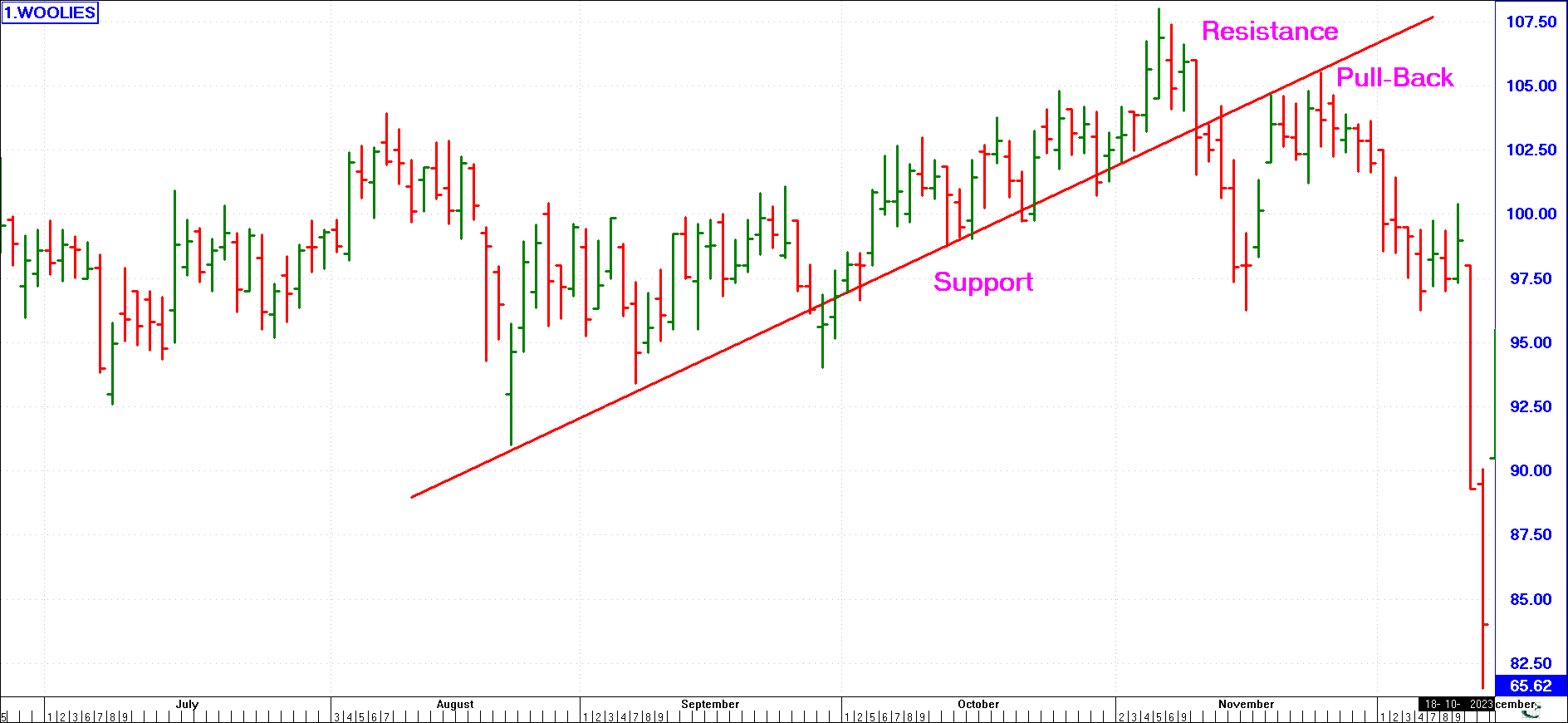
This occurs when a well-established uptrend support line has been decisively penetrated on the downside. However, after the initial decline, the price rallies back to the original trend line but is unable to progress further. In effect, the original support line now appears to offer resistance to further rises. This sequence of price changes is called the pull-back effect, and experienced chartists often use it to sell their remaining holdings in a particular share.
The Fan
(click image to enlargen)
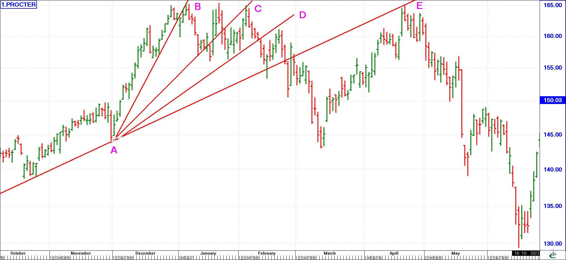
This is an interesting formation. A rising trend line A-B has been ruptured on the downside. After a brief decline, a new trend line A-C develops, angled less acutely than A-B. The new trend line A-C, itself, now breaks down, but after another decline a third uptrend A-D is traced out at an even less acute angle. A succession of uptrend lines like this, each angled less acutely than its predecessor, is called a fan, and when the third line gives way, a major downtrend almost invariably follows. Fans may also occur when a prolonged downtrend reverses to the upside. In this case, however, there would be a series of three down-sloping lines, each angled less acutely than its predecessor, being penetrated on the upside. When the third line gives way, a major uptrend almost inevitably follows.
Break-Out
(click image to enlargen)
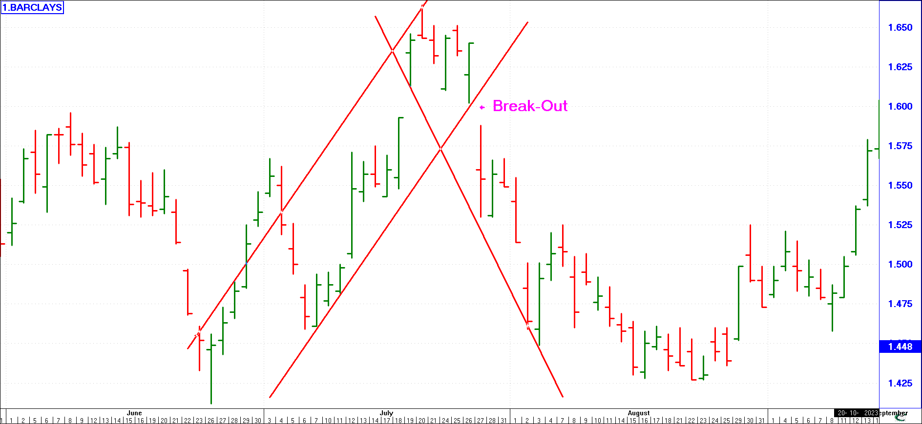
After a period of indecisive movement or congestion, a breakout occurs, be it up or down.
An upwards breakout after a period of congestion is a buy signal.
Rally
(click image to enlargen)
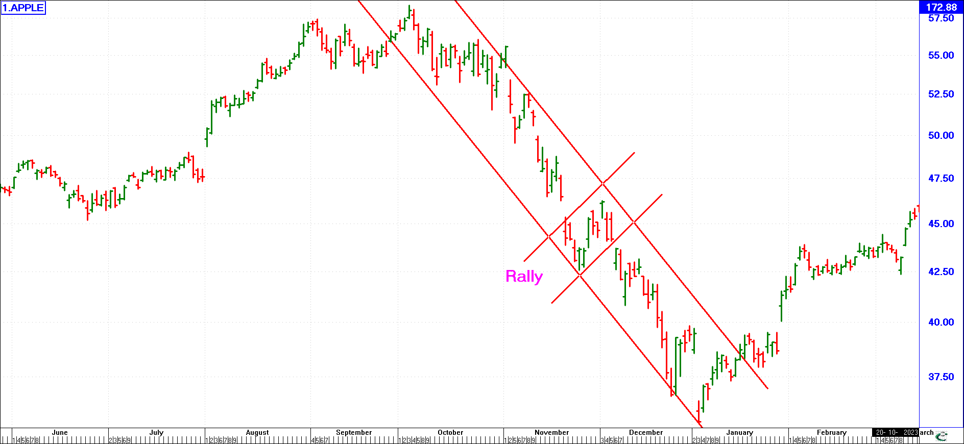
Where a share is in a major bear trend, any rise in price is called a rally. The overall trend is still a bear trend.
In the example shown here, we have identified two rallies. A major change in trend from a bear to bull market will initially start with a rally. This is seen at the beginning of January.
Correction
(click image to enlargen)
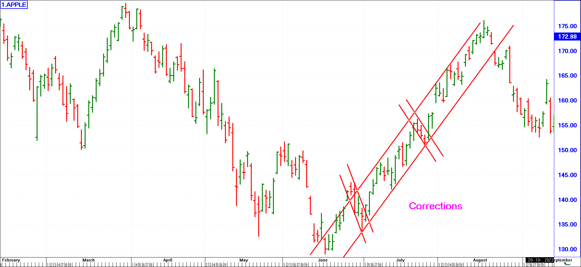
When a share is in a major bull trend, any fall in price is called a correction, although the overall trend is still a bull trend.
Signs of A Reversal in Trend
David Fuller, author of the Fuller Money international newsletter, developed a study of technical analysis called “Behavioural Technical Analysis”.
One of his major contributions to this study was to identify and highlight the 3 major characteristics of a reversal in trend before they actually occur. So the early warning signs of an imminent market reversal are:
Acceleration in the Share Price
(click image to enlargen)
This can occur in a short, medium or long-term trend. The share price soars upwards in a vacuum of supply (demand exceeds supply, or remains constant while supply diminishes.) Here we borrow from Newton’s Laws of Motion - for every strong upward movement in price there is an opposite downward movement. If the price comes crashing down, it may take the share price a long time to recover. The logic behind this is that a sharp downward movement in price adversely affects investor sentiment. A slower fall in price will not affect investor sentiment so adversely and we are likely to see a quicker reversal in the trend.
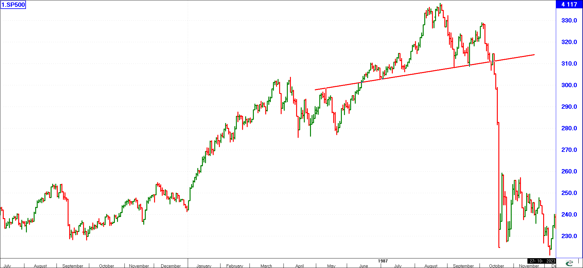
False Breaks
(click image to enlargen)
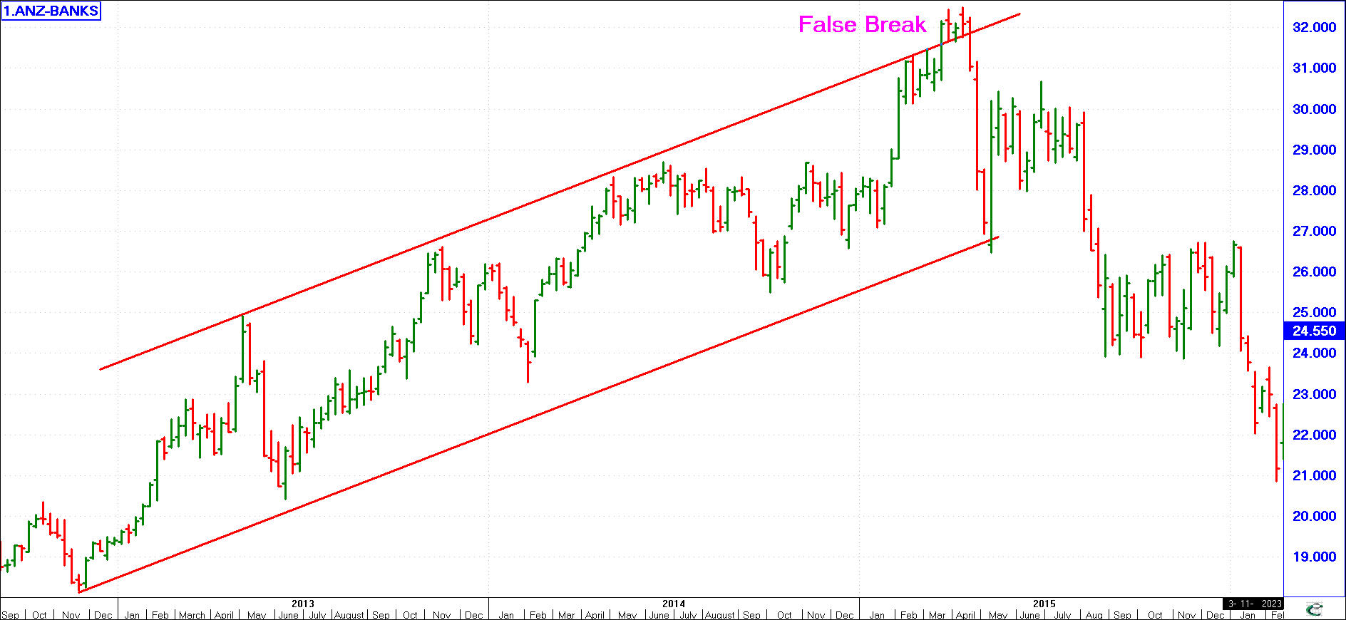
When a market is trading in a range bounded by a resistance and support line (a channel), it may attempt to break upwards (or downwards) but, unable to sustain the break out, slips back into the trading range. This is a sign that the market is losing momentum and the peak of the false break will often be the peak prior to the start of a bear trend. Once the price breaks down through the lower boundary of the congestion area (i.e., the support line), it starts wide-scale selling driving it to lower levels. An increase in volume traded at this level would confirm that the bull market has ended - remember, the acceleration in share price took place because there was little supply and strong demand - when volume increases it means there is a sudden rush of sellers.
A false break downwards through the lower boundary of a share price’s trading range may, conversely, precede the start of a bull run.
Violent Swings at the Top (or Bottom of the Market)
Where you see wild swings in the graph, be they at the top or the bottom, this is the third sign of an impending reversal in the trend. There are three subcategories to bear in mind:
A) Churning - the graph starts to churn, whipsawing up and down.
B) Time - the cycles in the graph are disturbed, tending to take longer than previously.
C) Size - the volume traded tends to be heavy on the left-hand side of the graph, tailing off towards the right. The size of the pattern is big.
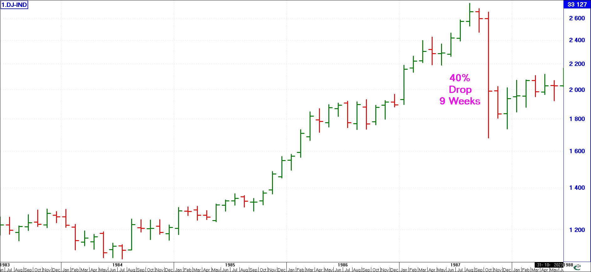
The stock market crash of 1987 displayed all these characteristics: there was a sharp acceleration in share prices, followed by wild swings in price in a narrow, but high range, accompanied by false breakouts. Then it cracked and some shares declined by as much as 60% over the next three to four months. The same pattern was evident in the great stock market crash of 1929.
Double or V-Tops
(click image to enlargen)
The “double top”, “V-top” and “Head and Shoulders” formations can all be surrounded by the three trend reversal characteristics. Head and shoulders and double top are a form of violent, churning markets. The V-top is a period of acceleration followed by a downward reversal.
Beyond the above, no matter which indicators you use, one important characteristic to watch out for is the occurrence of divergences - e.g., when the market makes a new high (or low) and the indicator of your choice fails to attain a new high (or new low). This action should also alert you to a possible reversal. Here is also a fine opportunity to use trend lines to highlight these situations. The identification of tell-tale patterns can further strengthen your predictions.
Identifying & Using Patterns
Often a share price movement develops a certain shape or formation that we can identify as a certain pattern. When this happens, the share’s future price trend can often be determined. Immediately the benefit of patterns becomes obvious as they are an invaluable early warning system for both investors and traders alike.
At the outset it must be emphasized that share movement does not always produce identifiable patterns. You may look at the price movement of your favourite share over the last decade and not be able to identify even one of the many possible patterns shares develop. This is not due to any lack on your part - some shares do not exhibit discernable patterns. The more well traded a share is (and hence the more humans involved in affecting its price) however, the more likely that share is to move at some stage in an identifiable pattern. There is no guarantee as to how many patterns you may find in a shares movement, nor how often they will occur. Patterns are a bonus to the technical analysts - when you see one, be grateful as you now have a better idea of the direction of that share’s future moves than most other investors. Finally, although the direction a share will trend in after an identifiable pattern is almost guaranteed, remember that it is an absolute fact that it will perform in that direction.
Many technical analysts get caught up in the game of trying to `label' every Pattern. While it might be good to be able to recognise certain patterns, going overboard is unwise. With experience you'll be able to distinguish the difference between Reversal Patterns (which identify a trend change) and Continuation Patterns (those which develop within a continuing trend). Patterns are best looked for on bar charts.
In addition to identifying patterns, you may be interested in the fundamental reasons why a share price moves the way it does to create the given pattern. Understanding the basics behind however, are not as important as identifying and using the pattern.
(click image to enlargen)
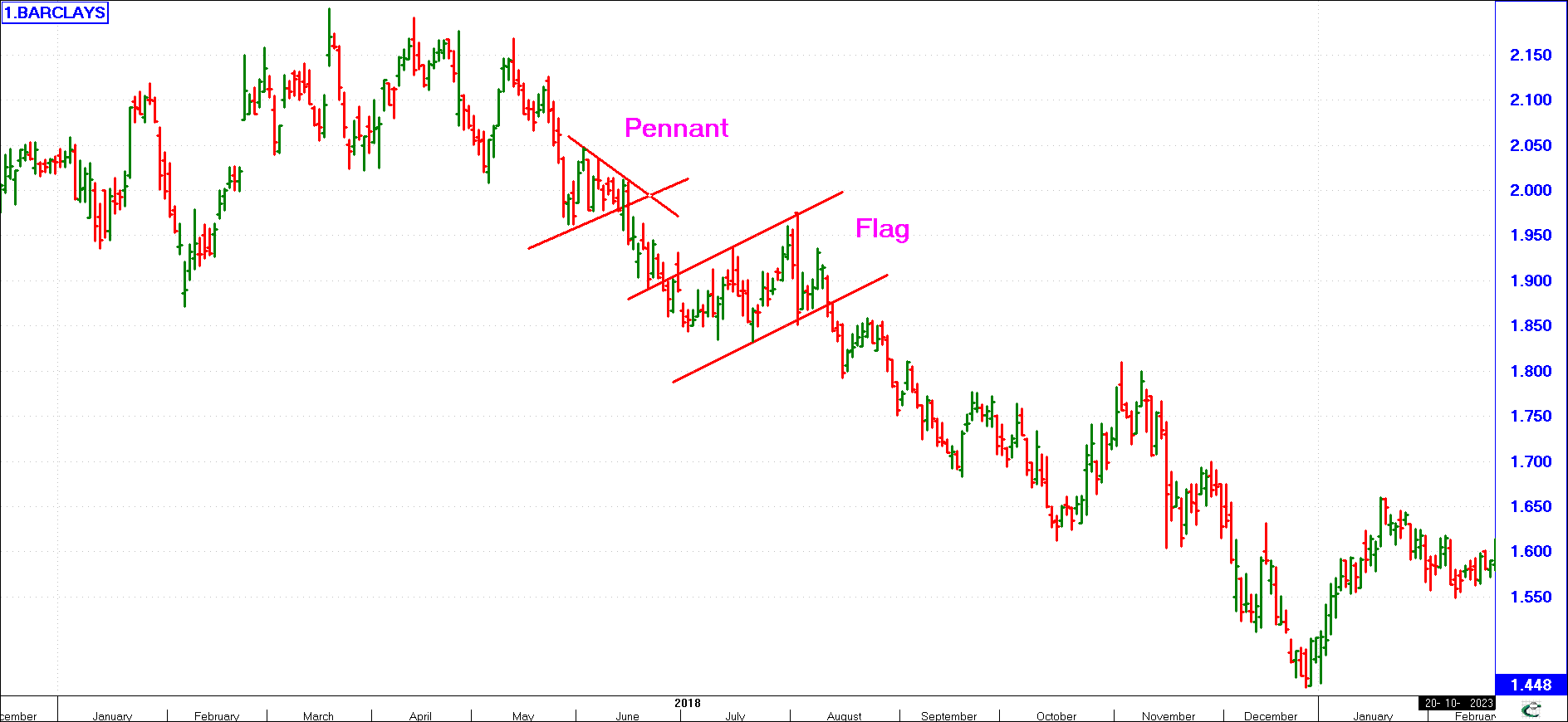
Flags & Pennants
These occur as either parallelograms or pennants (or wedges). They usually last only a few days - perhaps 5 to 15 days - and invariably fly against the trend as shown here.
These patterns are created by two opposing sets of investors active in trading the given share, namely optimistic and pessimistic investors. The optimists feel that at the lower level this share is a good buy. As it falls to this level, they buy and this stops the price from going lower, and it rises. As it rises, the pessimists step in, convinced that the current levels are the highest it will attain and they start selling. This caps the rise at this level and may in turn start it back down to lower levels so that the optimists step back in. This happens time and again and the price bounces between these two levels. At some point one group will give way and the winners will force the price strongly in their direction.
Flags and pennants are reliable and usually they mark the halfway stage of a sharp move. Often the length of the leg into the pattern will give you an idea of the probable length out of the pattern. In such instances, this pattern is a continuation pattern - the current trend direction continues after the pattern is complete.
(click image to enlargen)
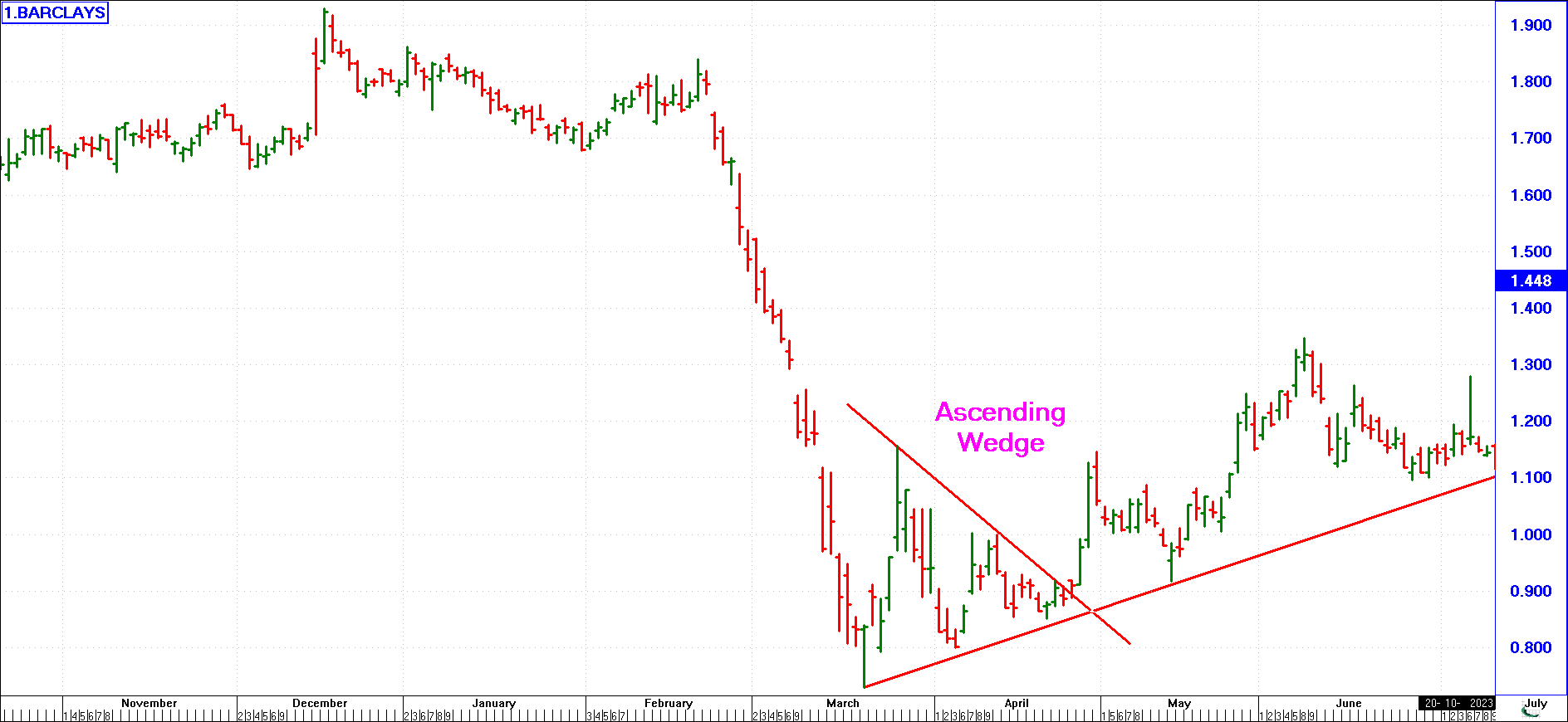
It is also possible for pennants or wedges to mark the end of a bull or a bear run. In such instances these are then reversal patterns (the current trend reverses direction). Shown opposite is an ascending wedge pattern that marks the end of the February-March bear run. Late March - April an easily identifiable triangle/wedge pattern formed. As it was forming, it was impossible to determine if it would be a continuation pattern, marking the half-way mark of the fall, or whether it would be a reversal pattern. Once the break out of the pattern occurred at the end of April, the smart investor could be confident that the bear run was over and he could re-invest with confidence.
(click image to enlargen)
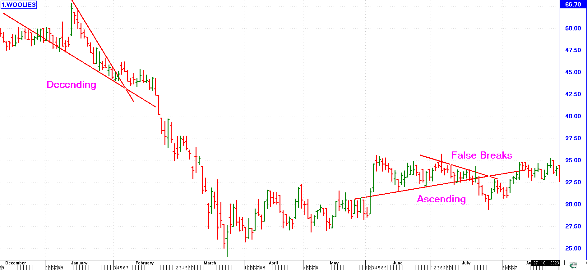
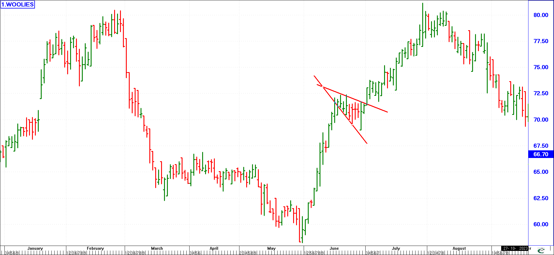
A Flag is usually a small parallel “channel” that develops against the trend. “Up” or ascending flags are the most common type. A Pennant or wedge is a converging triangular shape. The Pennant or Wedge can be either ascending or descending. The term ascending or descending depends on the slope of the support line of the pattern as shown in this example. When drawing your lines to identify a pattern, note that as shown above, the share price may briefly break out of the pattern. This is known as a false break and it gives no conclusive evidence of what direction the final break will take.
A novice chartist might be tempted to think that a rising wedge is a bullish pattern since both borders slope upwards. However, this is not so! In fact, a rising wedge atop a long advance is an extremely bearish formation, signifying that each rise to a new high is feebler than its predecessor, until finally demand falters substantially, and the entire trend reverses. Once the downside breakout occurs, there is usually a rapid decline in prices.
Curiously enough, although a declining wedge is a bullish reversal pattern, when the upside breakout occurs, prices advance far more slowly initially, giving investors plenty of time to take a position.
(click image to enlargen)
Triangle Formation
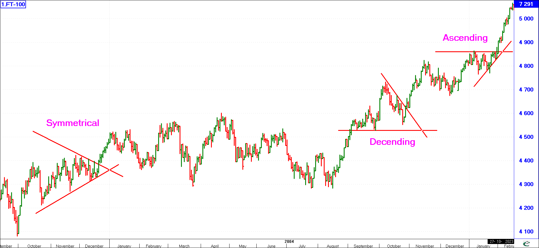
This is a special form of the Pennant or wedge. It is when a graph ranges sideways but the tops and bottoms of the graph start narrowing to the right. By connecting the upper and lower tops and bottoms by means of trend lines, a triangle is formed. A break out one way or the other gives a buy or sell signal. There are three types of triangles, namely: Symmetrical, Ascending and Descending as shown here. The difference from an Ascending/Descending Triangle to that of an Ascending/Descending Wedge is that with the triangle pattern, one line is horizontal.
Broadening Formation (Trumpet)
Also called Widening Formations or Megaphones. This pattern may be regarded as the opposite of a triangle, in that the vertical extent of the price fluctuations gets progressively greater. Broadening formations are common top reversal patterns, but are hardly ever found at major bottoms, unlike the other reversals which occur at both tops and bottoms.
With a triangle/wedge pattern the investor has a clear idea of what time frame the big break will occur in, namely before the two converging lines meet.
Widening Formations
(click image to enlargen)
If the lines of the pattern diverge or widen, as shown in the example here, this is no longer the case. The reasons behind this pattern are the same as above, but now each opposing side has a large number of uncertain bystanders. As each move in the market occurs, some of the uncertain players feel that this is the move, and join in pushing the move to higher (or lower) levels than before the opposition counter attacks. As more and more players join each side, the swings become wider and quicker. When the break finally comes, it is usually extremely large.
Gaps
(click image to enlargen)
Gaps - During an up move on the stock market, the lowest price of a share or index during a given week’s trading may be higher than the highest recorded the previous week. On a weekly bar chart this shows up as a vertical gap between consecutive bars. Similarly, a downside gap occurs when the highest price during a week is lower than the lowest price recorded the previous week.
There are various types of gaps. Gaps appear more commonly on the charts of shares traded very lightly, in which a small order to buy or sell may produce wide movement in price. Actively-traded stocks produce few gaps, but those that are produced are certainly of greater significance.
The breakaway gap
(click image to enlargen)
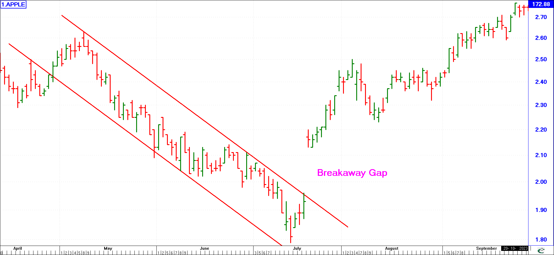
The breakaway gap occurs after a reversal pattern. It often marks the start of a major price move. A rise in volume usually accompanies an upward breakaway gap, and is likely to show a greater range between the day’s high and low prices. In other words, there will be a longer vertical line on the chart. Looking at this example of Apple, the price came up against resistance a number of times as it fell and rallied over May to July, before it finally broke out in mid-July. As it breaks out, it leaves a gap, known as the breakaway or breakout gap. The criteria for a breakaway or breakout gap is that it trades to the upside of the resistance line such that its lowest trade for the day is higher than the high of the previous day (i.e. there is a gap). Not all breakaway gaps are as pronounced as this example where the low of the next day was 213, almost 9% higher than the high of 196.
(click image to enlargen)
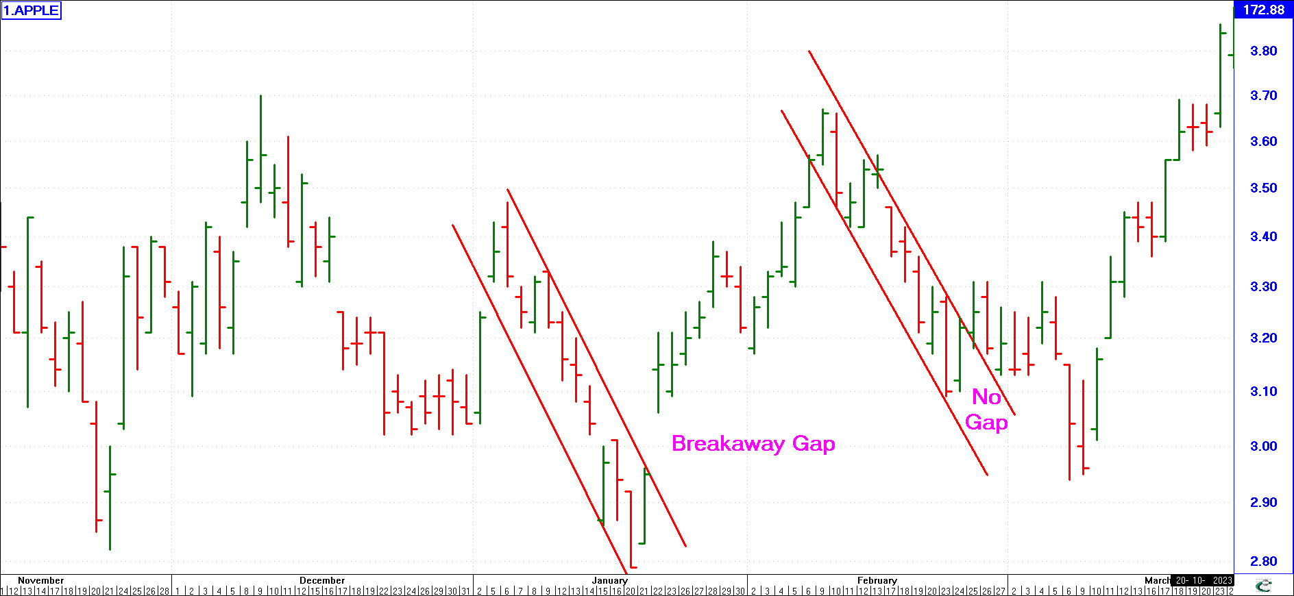
Note the example opposite.
The price broke out of the downward channel in January and there was a Break Away Gap. Also during February there was a downward channel. Again, at the end of February it broke out of this downward channel.
However, part of the trading on the day of breakout overlaps the previous day. There is no gap! This second break out is NOT a Breakaway Gap pattern!
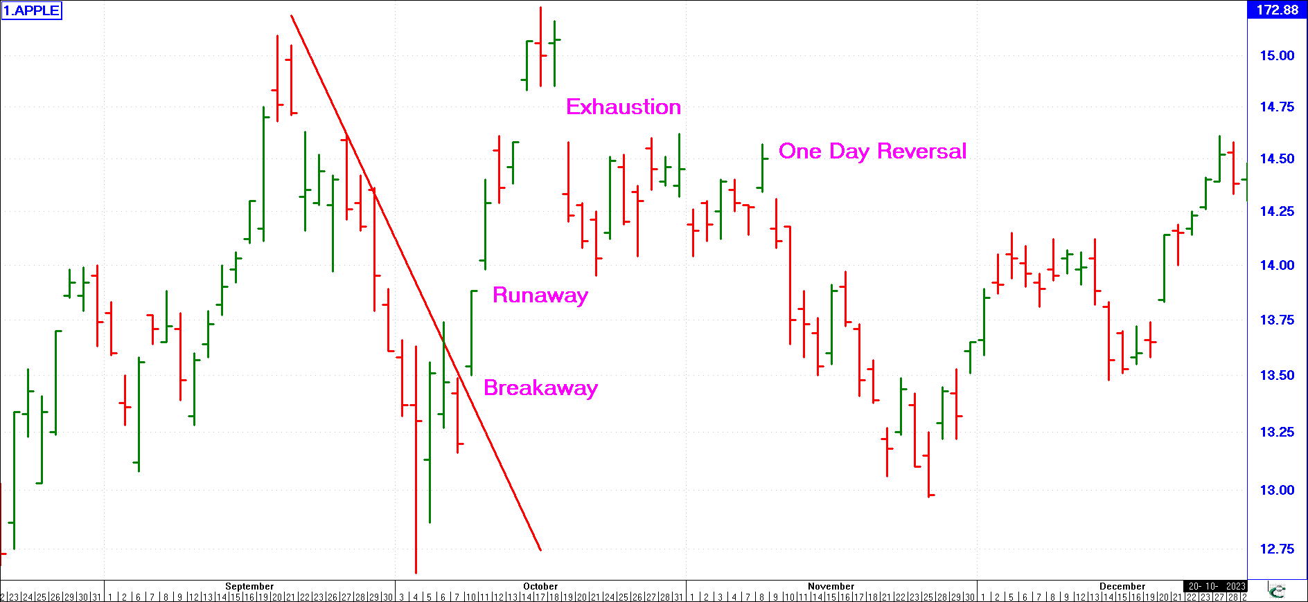
The Runaway Gap
(click image to enlargen)
The Runaway Gap occurs during the middle of a strong movement and is often a sign of great technical strength where traders jump aboard, fearful of missing the boat as it shows a sharp move after a big reversal pattern or out of a big congestion pattern.
A runaway gap means that the lowest trade of today is well above the highest trade of yesterday, thus creating a gap in the upward price move. Very often runaway gaps will occur just after a breakaway gap. It should be noted that a breakaway gap is a runaway gap that broke up through resistance starting a trend reversal.
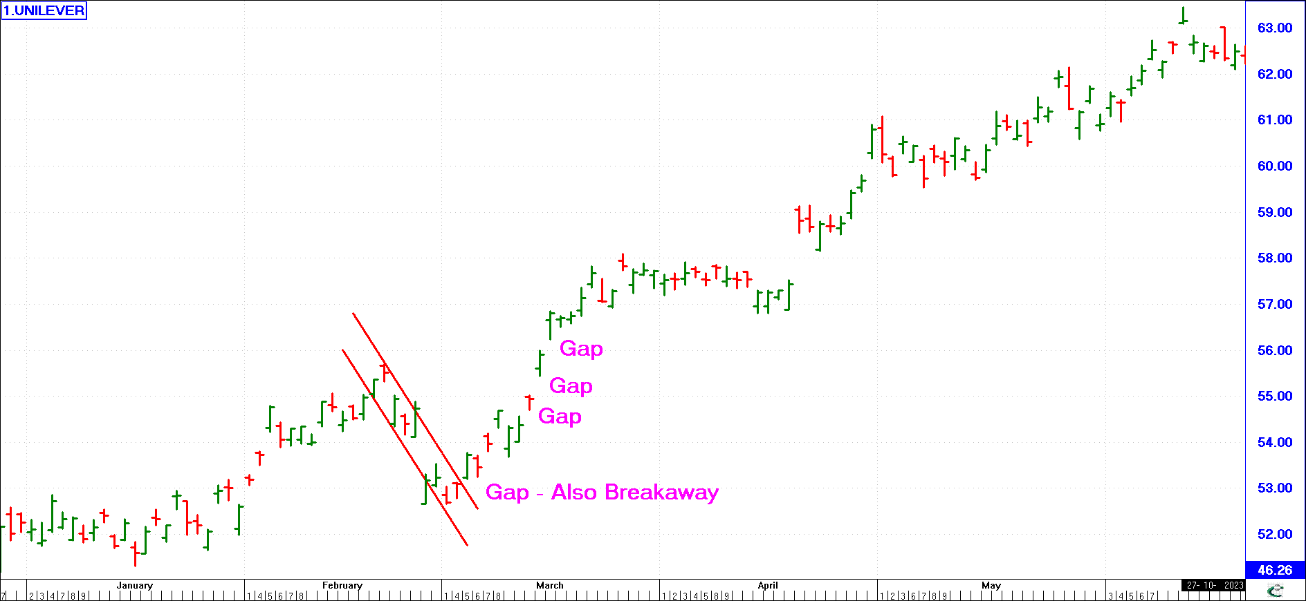
The Exhaustion Gap
(click image to enlargen)
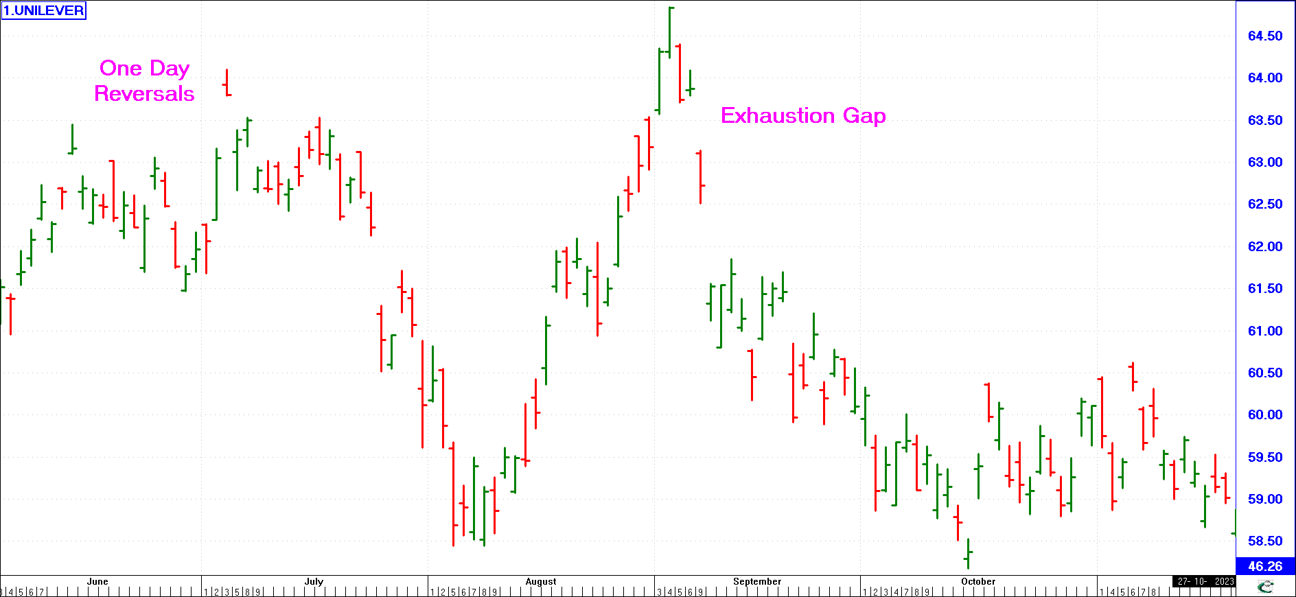
The Exhaustion Gap occurs at the end of a strong bull or bear run when a market changes trend. Identifying it is hard until a few days have passed. Invariably stock holders, following one final buying spasm which produces the gap, may decide to sell, resulting in a major trend reversal. Often the exhaustion gap occurs as the price falls through support.
It is not uncommon for multiple exhaustion gaps to occur as shown here. This is typical of a rapidly falling market where as shown, Unilever lost the entire gains of August in September, losing over 50% of the month's fall in just 4 days!
Island Reversals
(click image to enlargen)
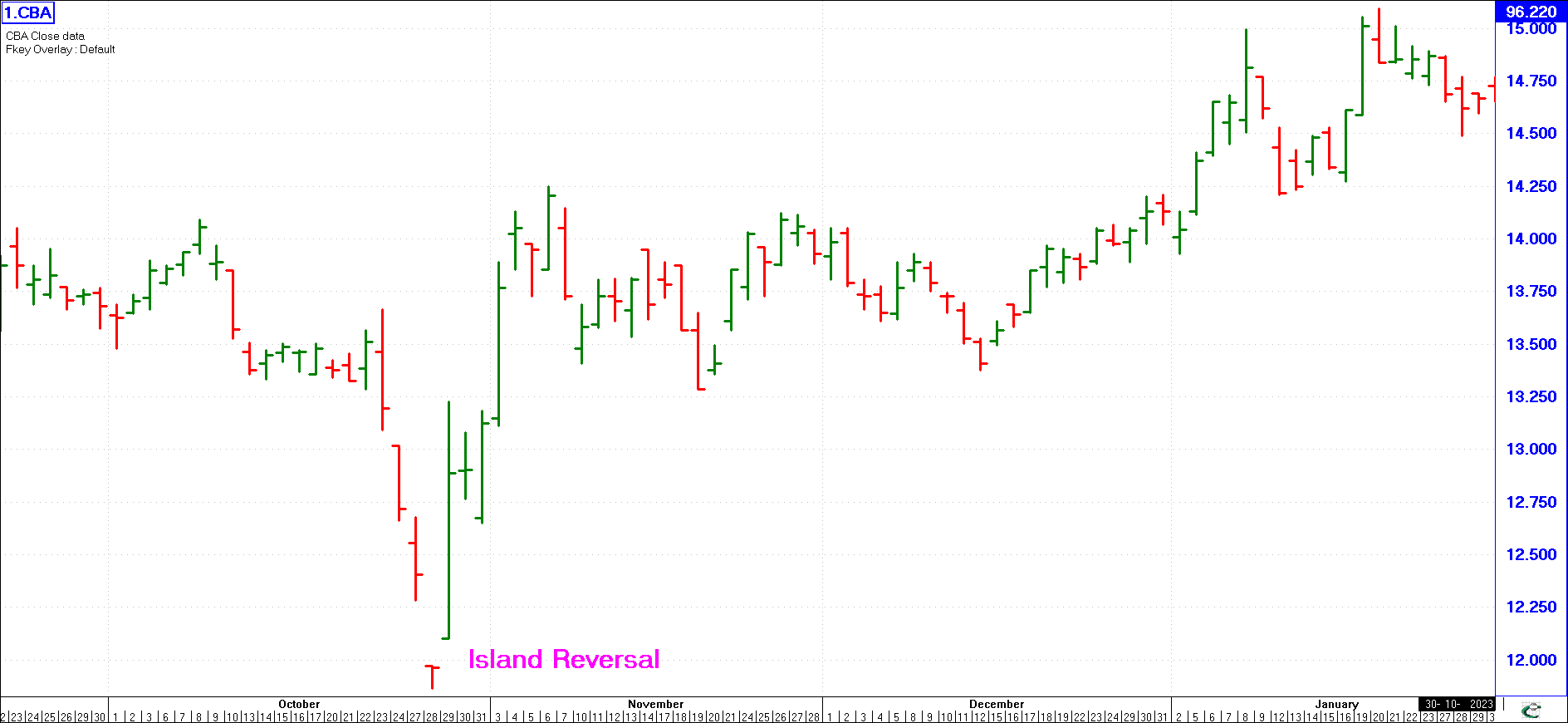
Island Reversals - following an “exhaustion gap”, prices may break down, and a “breakaway gap” appears on the downside. The area between the upside and downside gaps constitutes an “island”.
The entire formation is called an “island reversal”.
Experienced chartists are aware that an island reversal is a very powerful reversal formation. As can be seen from the above example, the island reversal signaled the start of a bull run that resulted in a 25% increase over the next 3 months.
One Day Reversal
(click image to enlargen)
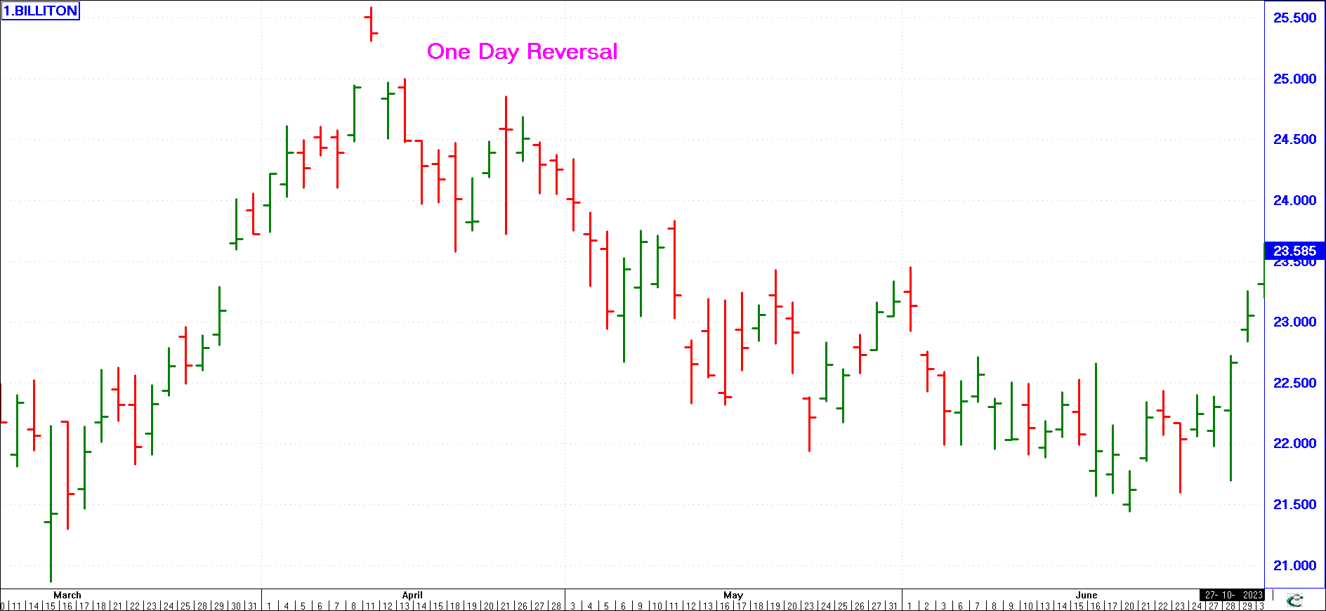
One Day Reversal - very much like the island reversal. This pattern usually occurs at the end of a very sharp upward movement. The market makes a high one day and the next day closes much lower.
In the example here, the market surged to 2559 the one day, considerably up from the 2493 close of the previous day. However, the next day it closed some 3% down at 2488 and continued down in the subsequent days.
(click image to enlarge)
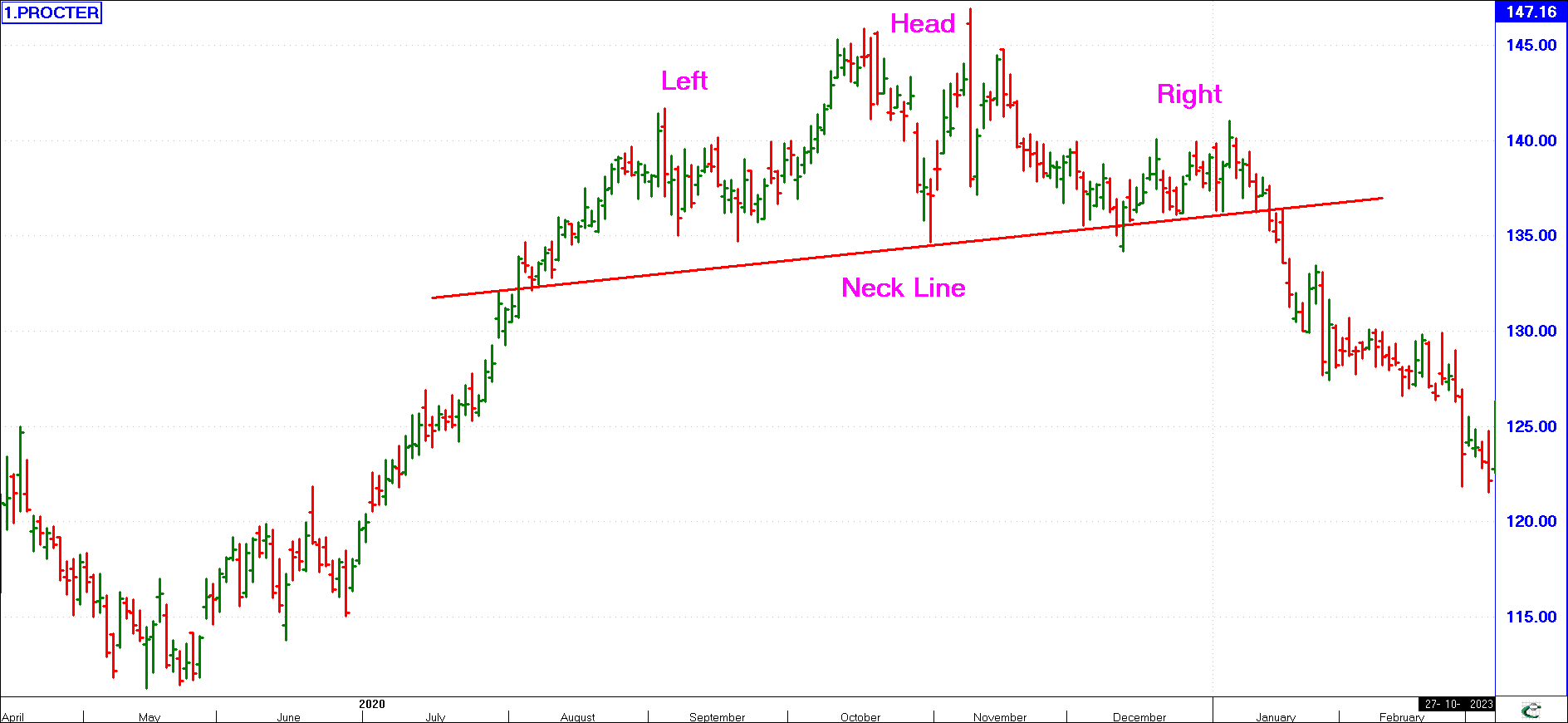
Head and Shoulders - This pattern develops at tops and bottoms and when it is identified can be truly rewarding. This chart clearly shows the silhouette of a left shoulder, head and right shoulder accompanied by the neckline of a head and shoulders top pattern. Usually, the neckline will slope upwards in a head and shoulders (H & S) top fashion and slope downwards in a reverse H & S bottom fashion. Volume is usually heavy on the left shoulder, lighter on the head and very much lighter on the right shoulder.
The head and shoulders suggest an impending bear trend. The logic behind it is quite simple: when the trend in a share price is reversing, you will find wild and volatile swings in the share price, reversing up and down with great speed, and this represents uncertainty in the direction of the share price. The “informed” investor anticipates that the market will reverse downwards and sells - this depresses the price (applying the laws of supply and demand, when supply exceeds demand the price should drop). The “uninformed” investor sees the first “shoulder” as a temporary correction in the share price and seizes the opportunity to buy into the share when the share price is slightly lower. This forces the share price back above the first shoulder, forming the “head”, at which point more investors decide they have made enough money from the share and sell, forcing the price down again. Once again, the uninformed investor saw a bargain and decided to buy into the share, pushing the share price up yet again, forming the second “shoulder”. At this point, the share has lost steam and will decline - this is the start of its bear trend.
(click image to enlarge)
Head and Shoulders Bottoms - appears exactly the same as a top. The difference is that it is upside down (and the neckline is descending), and climaxes a long decline rather than a rise.
example of this is shown here. Although the features are the same as before - the left shoulder, head, right shoulder, the neckline, pull back, etc., the volume action typically is somewhat different and usually expands throughout the formation, except for a decline on the pull back.
(click image to enlarge)
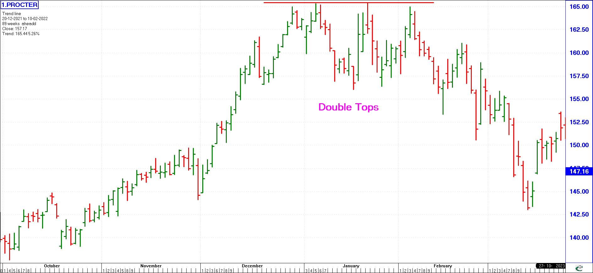
Double Tops/Double Bottoms - This pattern usually occurs when, after a top has been made, the subsequent rally fails to get above that of the previous top. Some technicians feel that a difference of around three percent between the two tops (or bottoms) is acceptable.
The chart shows an unmistakable double top which was followed by a significant setback.
(click image to enlarge)
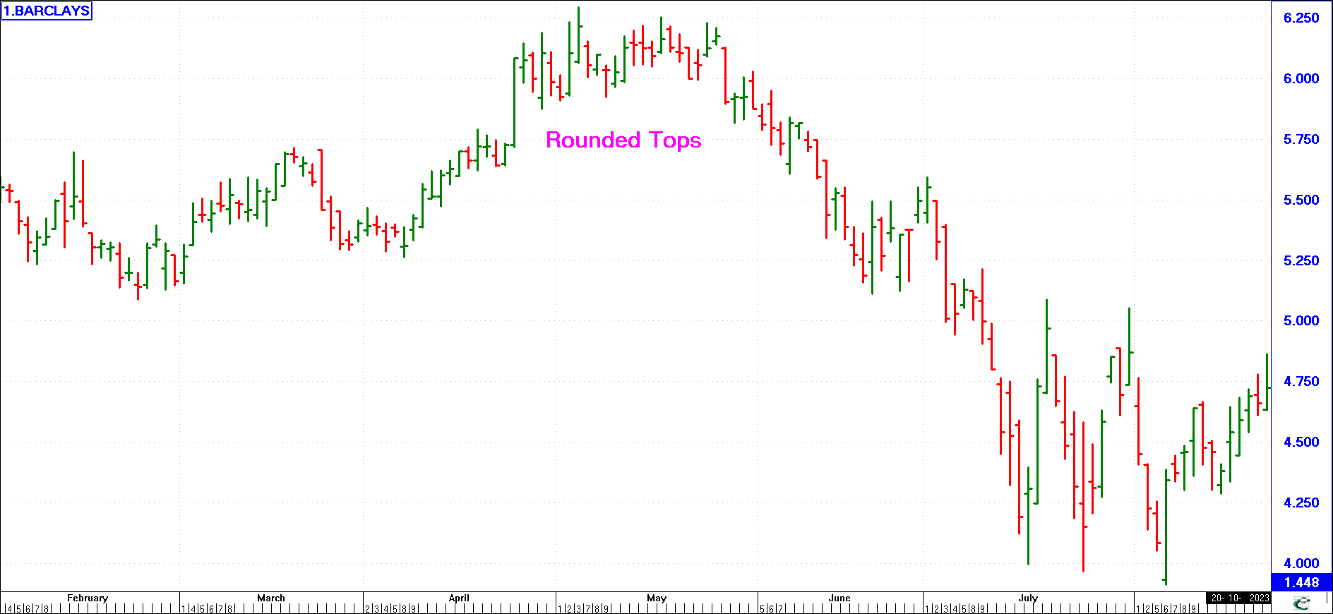
Rounded Tops (or Bottoms) - Some analysts call these patterns Saucers or Umbrellas. These tops (or bottoms) may be a type of compound Head & Shoulders.
Take into consideration that the double top has (obviously) two tops, the Head & Shoulders top has three tops and the chart here shows a rounding top with five localised highs during late April to mid-May.
(click image to enlarge)
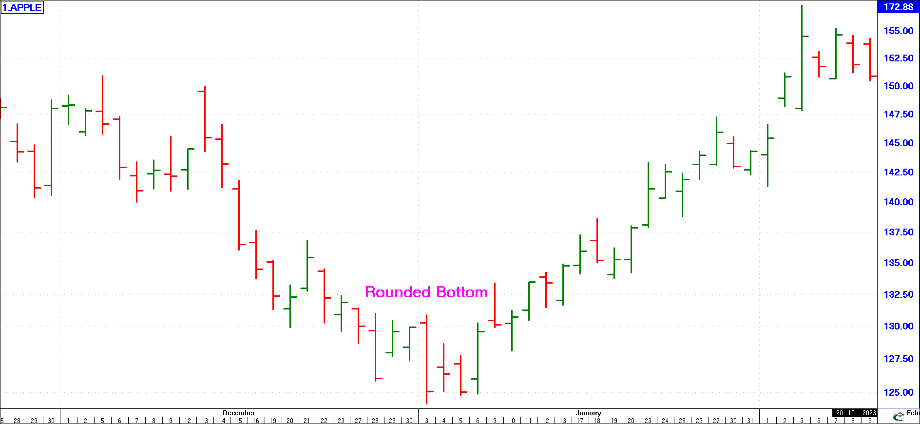
In the example opposite we have an example of a rounded bottom.
After the rounded bottom occurred, the market rallied.
Conclusion
Having successfully completed the material in Lesson 3, you will now understand what Technical Analysis is all about. Although at this stage you may not fully understand how to use the various types of technical charts to time your investments, you will at least know of their existence. You will learn more about the charts in the next lesson and again in the final lesson of this course.
The most important aspect of Lesson 3 that you should now understand is that the market often exhibits certain identifiable patterns and then proceeds to react in a predictable manner thereafter. Study the charts shown, and any other charts you have at your disposal until you can readily identify market patterns. Market Patterns, although covered in this first lecture on technical analysis, along with the general basics, is an all-important technique that you must become totally proficient in, as you should always use it.
Lesson 4 will take you to the next stage in technical analysis, namely the applying of Moving Averages and Indicators.
(You can also obtain this Lesson as a PDF document from our Services Menu, or click here)