Lesson 4 - Technical Analysis - Indicators and Moving Averages
(To obtain this as a PDF document click here)
Unfortunately, in life, there is no real free lunch. This is very much the case with investing. There is no method that can signal you exactly when to buy a share and exactly when to sell it. However, as already seen in the previous lecture on trends and patterns, using such methods one can get a better-than-average idea of the possible future direction of a share price. As discussed, none of these methods are totally infallible. Thus, to be a successful investor, one needs more tools to assist with timing. Using a range of tools and making an investment decision based on them all ensures that your success rate greatly improves.
Indicators are one of the methods used by technical analysts to try and determine when the share price is due to reverse direction from its current trend. However, before we even go into the subject of indicators, you need to never forget that “No single indicator will consistently provide perfect buy and sell signals for all shares”. If there was such a thing, we would all use the same indicator and all be very rich!
As this is not the case, there exists a vast array of different indicators out there, with new ones being created every day. Just as there are different types of markets (some trend for long periods of time, others are extremely volatile), so too different types of indicators have been developed to operate in them. Don’t despair at this point, for there are some very good tried and tested indicators that provide good results in most situations. These will be discussed shortly.
First, the concept of investing is to buy at some point such that at a future date when you want to sell, the share price is higher than when you bought. The ideal time to buy would be just at that point when a bear run turns into a bull run. Again, the best time to sell would be at the instance that bull run ends. Thus, indicators are designed to identify (or indicate) possible market reversal.
Moving Averages
(click image to enlarge)
Most investors will have heard of Moving Averages and although they are really just another indicator, the fact that they were the very first indicator used in the stock market and since over the centuries many variations have been devised, we will discuss them separately from the many indicators that were subsequently developed.
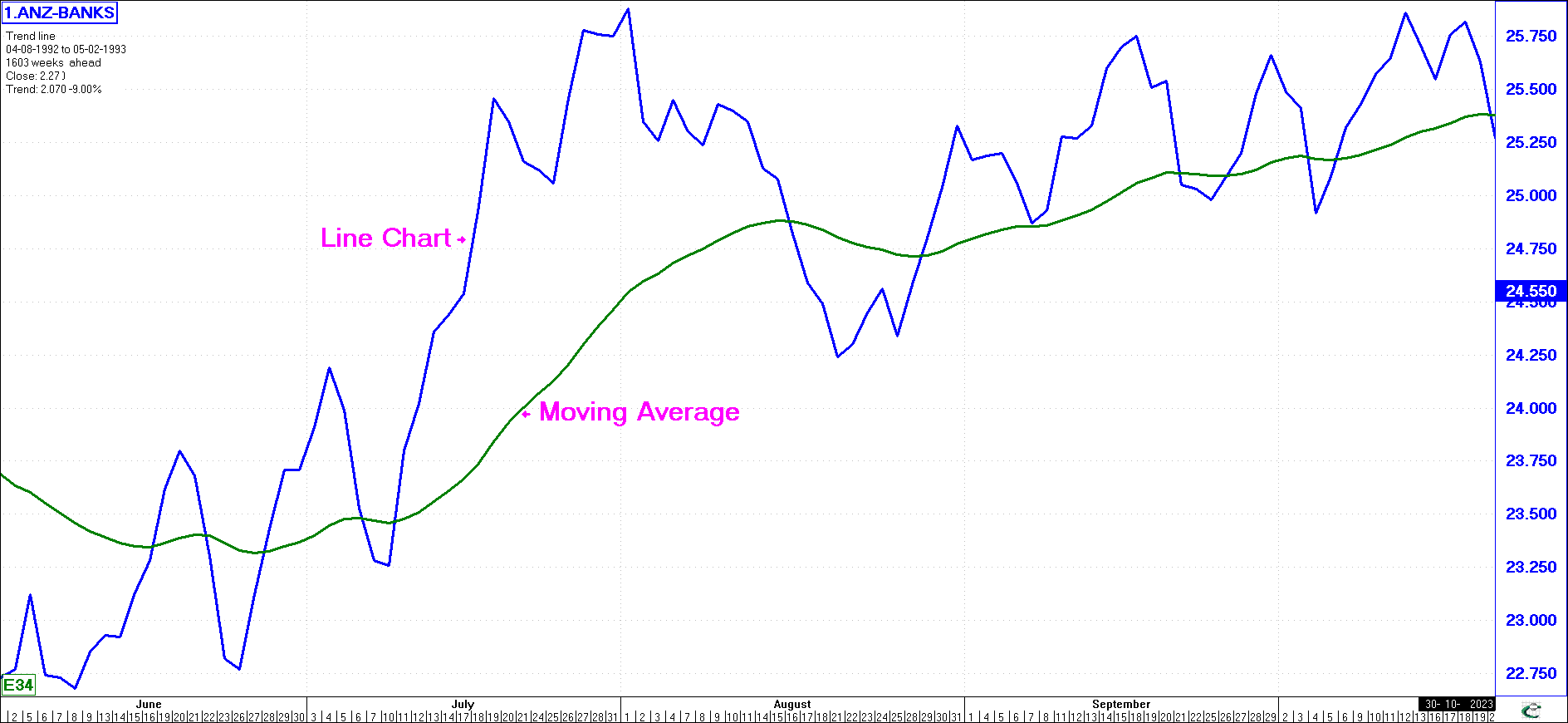
Moving Averages are one of the most basic (and oldest) tools of technical analysis. As such, they should be a vital tool for EVERY stock market investor.
The graph shows a Line Chart of the Australian ANZ Group (Bank) with a 34-day moving average (the moving average is the smoother of the two lines - sometimes it is drawn as a dotted line or, as in this example, a different colour) superimposed on it.
The moving average has a period (i.e., a single variable that you must supply). In the above chart, we used a 34-day moving average. This is computed by adding together the last 34 closing prices for the share and dividing this sum by 34. This yields a ‘smooth’ line that eliminates many minor zig-zags caused by daily price fluctuations.
The longer the time period used (i.e., an 89-day moving average is longer than a 13-day moving average), the smoother the moving average line becomes. However, the longer the time period used, the fewer profit opportunities displayed.
During a bull trend, it is ‘normal’ for the closing price of the share to be above its moving average. Conversely, during a bear trend, the closing price would be below its moving average.
The Buy and Sell signals are given when the price graph and the moving average intersect. When the price crosses down through a moving average line, this is usually interpreted as a sell signal, and when it crosses up through the moving average, this may be interpreted as a buy signal. This helps us to buy shares when the price is low but starting to move up and sell them when they are high and starting to fall. The moving average, correctly used, prevents an investor from holding a share when its price is falling.
Using Two Moving Averages
(click image to enlarge)
Most often,
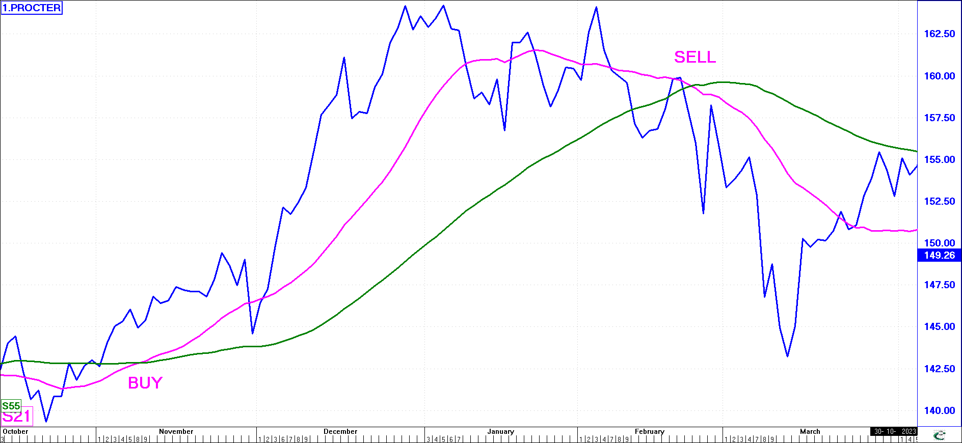
two Moving Averages are used, and when they intersect (i.e., the two moving averages rather than just a single moving average and the price), as shown in the chart opposite, the trend or direction can be said to have reversed.
This trend change can be used as a confirming buy or sell signal. Here, the buy signal on the Consumer Goods company Procter & Gamble was given at 14503, and the sell signal at 16088. The simple 21 and 55-day Moving Averages have been used.
There are usually six stages in a ‘typical’ bull-to-bear reversal. Variations are possible as no two patterns are ever identical. The six stages are (January to March):
| 1 |
The closing price, after a prolonged rise, turns down (i.e., peaked at 16415).
|
| 2 |
The closing price crosses below the shorter of the two moving averages (i.e., the 21-day).
|
| 3 |
The shorter moving average itself turns down (i.e., the 21-day).
|
| 4 |
The closing price crosses below the 55-day moving average.
|
| 5 |
The 21-day moving average crosses below the 55-day moving average.
|
| 6 |
The 55-day moving average itself turns down.
|
The general rule regarding the above is that the earlier in the sequence you sell your shares, the higher the price obtained, but the greater the risk that the trend reversal will itself be reversed to the ‘upside’. Conversely, the further the sequence progresses, the more certain you can be that the bull trend really has reversed, but the prices you will receive for your shares will be lower.
The moving average therefore takes the minor fluctuations out and tries to retain the general trend. The price graph will only cross the moving average line after a sufficient delay (depending on the length of period selected for the moving average calculation). Because the trend of the moving average line lags that of the price graph, you will only receive a buy or sell signal after the price graph has shown a significant reversal in its trend.
The Moving Average is thus a lagging indicator (it shows a market reversal only after it has started).
Trading with Moving Averages
(click image to enlarge)
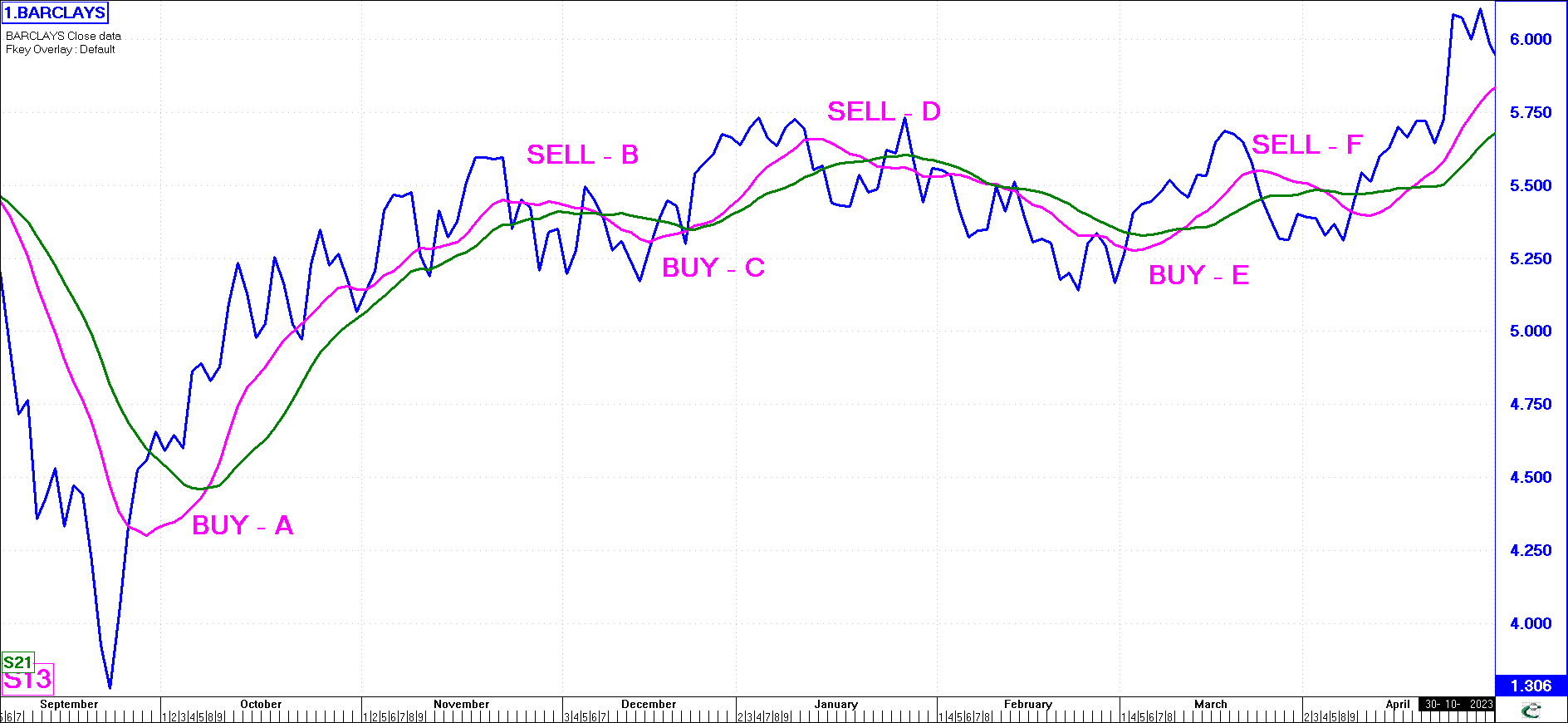
So if you want to make quick profits, take a short-term moving average (such as a 13 or 21-day moving average) but remember that you may receive false buy and sell signals if the share is volatile. Moving Averages work best in trending markets since they tend to keep you invested with the trend (as in the chart above). However, when the market is in a congestion phase (as in this chart of Barclays), Moving Averages tend to 'whipsaw' you rapidly and unprofitably in and out of the market. Notice on the chart, the Buy signal (A) at 483 and the sell signal (B) at 539, followed by the Buy signal (C) at 554 and the sell signal (D) at 549, followed by the Buy signal (E) at 544 and the sell signal (F) at 536. Although the first trade (A - B) was up 11%, your next trade (C - D) was a loss, as was the next trade (E - F).
Bar Charts with Moving Averages
(click image to enlarge)
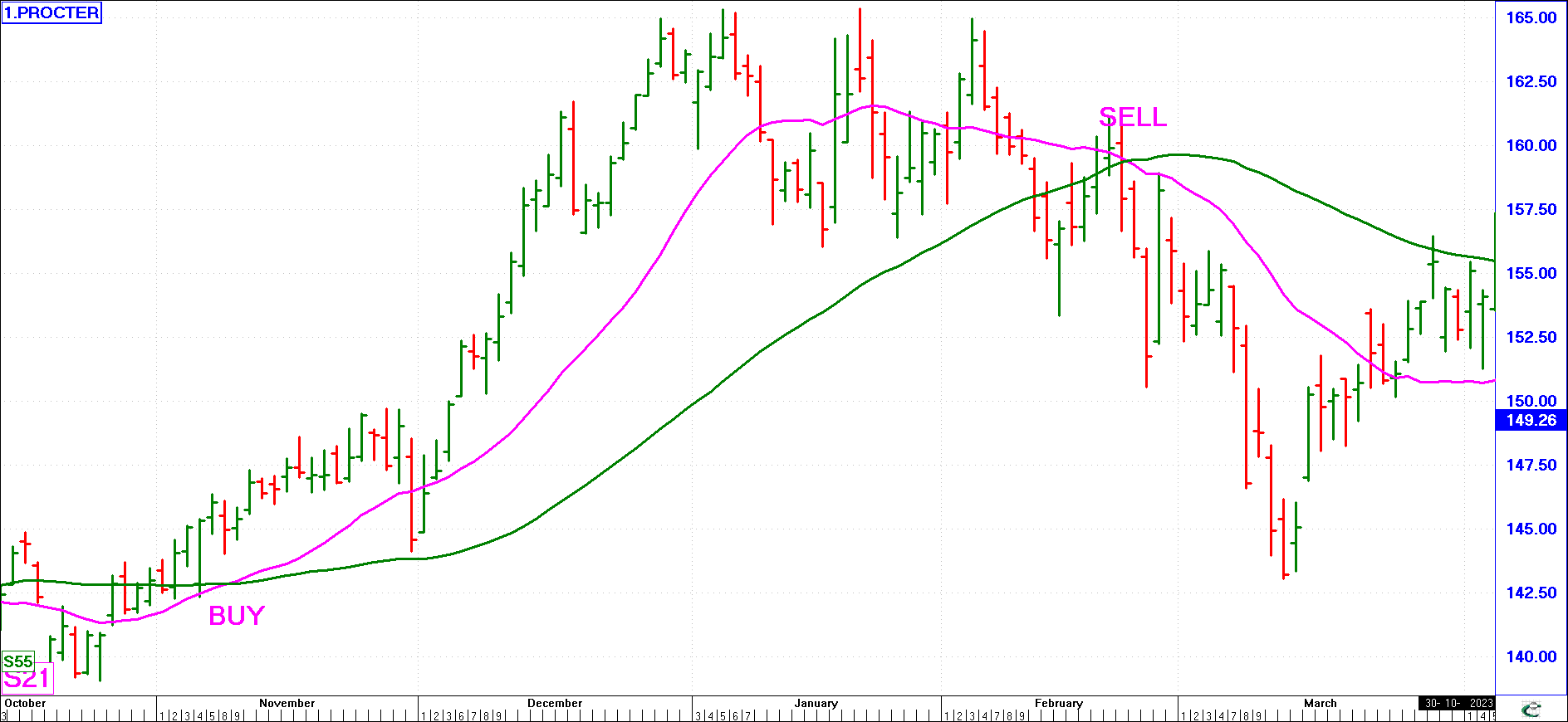
Moving Averages can be used with bar charts as well as line charts and if you want to find the longer-term trend direction, weekly charts can be used. The chart here shows the same stock as used previously (Proctor & Gamble) as a Bar Chart using 21 and 55-day moving averages. Thus, not only can you display moving averages on both Line and Bar charts, but you can also display them on Daily, Weekly and Monthly time period charts. The period of the moving average relates to the time period of the chart. A 13-period moving average will be a 13-day moving average on a daily chart and a 13-week moving average on a weekly chart.
Simple and Complex Moving Averages
(click image to enlarge)
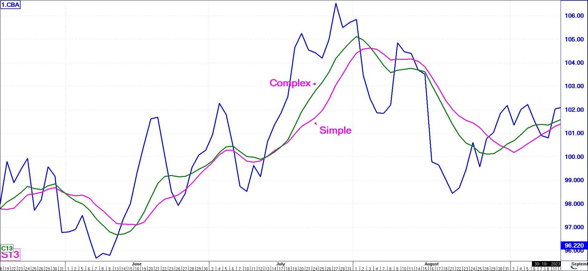
There are many different kinds of Moving Averages. The most popular varieties include Simple, Weighted, Complex Weighted, and Exponential Moving Averages.
This chart of the Commonwealth Bank of Australia (CBA) is shown using a 13-week Simple and 13-week Complex Weighted average.
Notice how each time the Complex Weighted moving average turns much sooner than the Simple Moving Average. The Complex Moving Average responds on average at least 2 days quicker than the Simple Moving Average when signalling a trend reversal.
Simple and Exponential Moving Averages
(click image to enlarge)
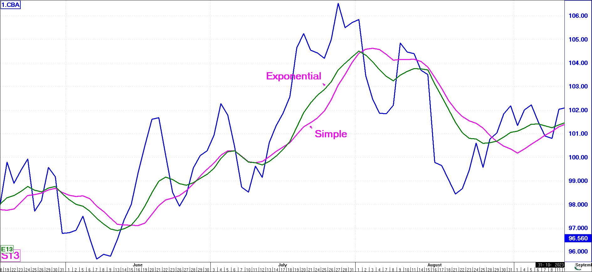
Also, notice the difference between the Simple and the Exponential averages.
The Exponential Moving Average responds on average at least 3 days quicker than the Simple Moving Average when signalling a trend reversal.
Use moving averages in combination and with different periods to find those which suit you best under varying conditions, whether you are trading, speculating, or investing. You will notice that of all the different moving average types, the Exponential Moving Average turns the soonest.
We strongly recommend that you mainly use the Exponential moving average as it is the superior trading/investing type of moving average. However, although the Exponential moving average responds to change far quicker than the Simple moving average, it still only provides signals after the event.
Choosing Moving Average Periods
As to what periods to use for your moving averages, the next section will give you some starting points.
However, remember the following trade-off that will always exist:
The shorter the period used for the moving average, the less smoothing it performs. This results in a quicker response to market moves, but a greater chance that the responded-to move may not be a major trend change but just a minor fluctuation in a continuing trend. This will result in more false signals. However, amongst those false signals will be correct signals. It thus becomes important to use other methods to filter out those that could be false.
Dealing with False Signals
(click image to enlarge)
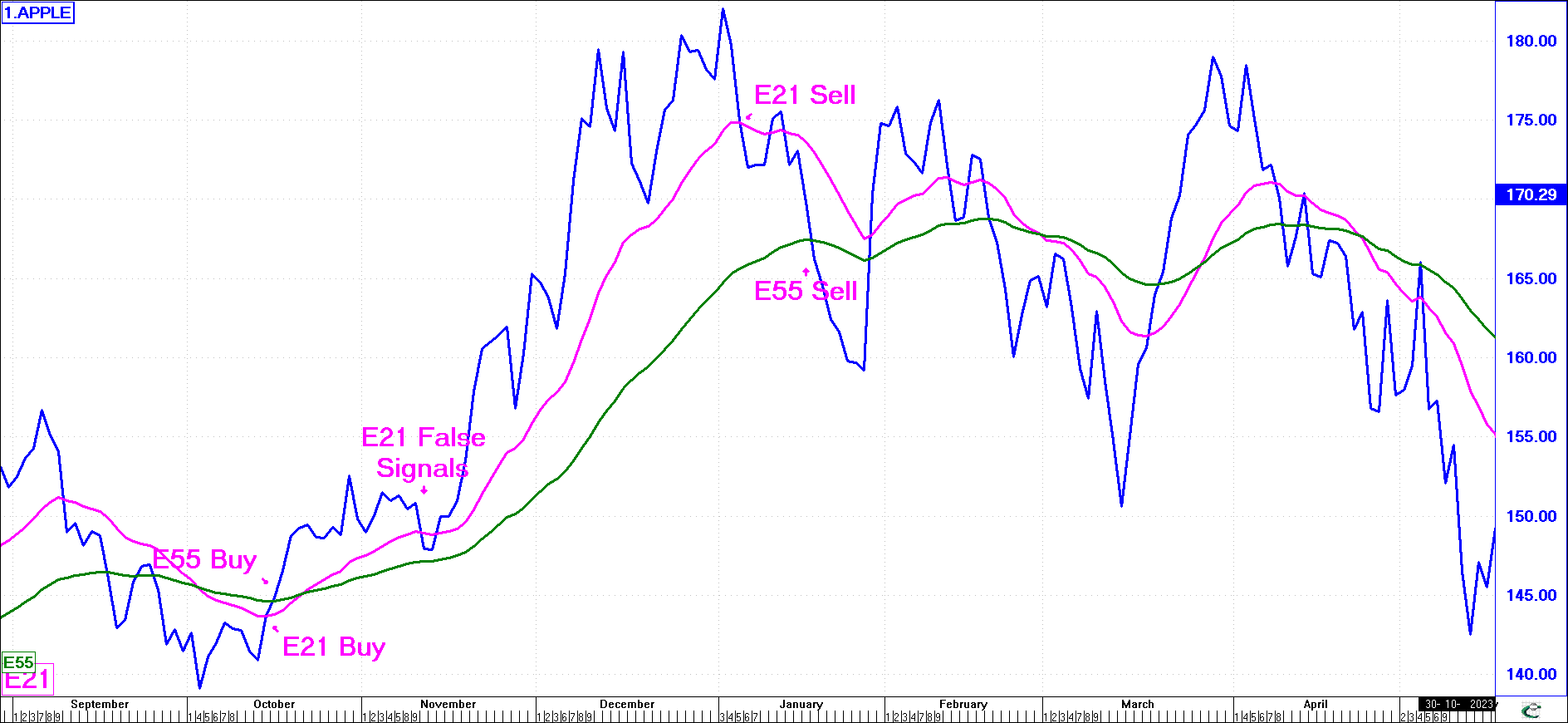
The longer you make the period used, the more smoothing it does, eliminating most false signals. However, the larger the period used, the later the signals are. It can thus become a problem where signals are given so long after the event that most of the potential profit is already gone.
In this example, the E55 gave a late Buy and a late Sell signal that still resulted in a profit. The E21 gave an earlier Buy (by 1 day) and an earlier Sell signal (by 8 days) resulting in far greater profit. The problem with the E21 signal is that during November it gave a number of false buy/sell signals that if acted on would have whipsawed you in and out resulting in a net profit at the end well below what was achieved with the more conservative E55.
From looking at the above example, you may decide that the profit generated by using an E55 during this time period was great and so an E55 moving average is the thing to use.
However, look at the future moves of the share and the signals given by the E55 day moving average. After the Sell in January, the share price moved sideways for a number of months. The E55 moving average, because of its slowness of response, then proceeded to give over 5 buy and sell signals, each resulting in you selling at a lower price than you bought (when taking brokerage into account). The E55 that gave such great signals in the bull market, failed dismally in the sideways phase the share then entered. Because of this, other, more responsive indicators were developed.
Before doing so, let’s look at what numbers in general you may want to use for Moving Averages and other soon to be discussed indicators.
What Numbers should you use?
The ones that give the best results! - Which are these? Where do you start? These are the most common questions asked about moving averages (and the various other Indicators discussed later).
Leonardo Fibonacci (1170-1230), was an Italian mathematician who discovered an extraordinary mathematical series in which each number is the sum of the two preceding ones (1, 2, 3, 5, 8, 13, 21, 34, 55 ... etc.). Any number in the series divided by its predecessor yields a ratio of approximately 1,618. If a Fibonacci number is divided by its successor a ratio of 0,618 is obtained (this ratio is less exact for the lower numbers in the series). Between alternate numbers in the series the ratio of the higher to the lower number is approximately 2,618, and the lower to the higher, 0,382.
The ratio 0,618:1 is the so-called “golden ratio”, and occurs in many natural objects from the spiral galaxies of outer space, to snail shells and microorganisms. For example, a sunflower has 89 curves, of which 55 wind in one direction and 34 in the other. Trees always branch from the base in a Fibonacci series. Many manmade objects (playing cards, your credit card), are made to this golden ratio dimension as the results are pleasing to the human eye.
What does all this have to do with the stock market? Investors have found that when they are selecting a time period for a moving average (or any other indicator), that the periods 5, 8, 13 are regarded as short term, 21, 34, 55 as medium term and 89, 144 and 233 for long term, they often produce good results. Elliott Wave buffs also present evidence that these ratios frequently represent the relationship between an impulse wave and its subsequent corrective wave (covered later).
Either way, plain, practical experience has shown these numbers to be the best starting place when deciding what periods to use for your moving average. Start here, and fine tune them as required.
Technical Analysis - Indicators
There are a whole host of Indicators available to the technical analyst. Indicators are tools (in the form of a graph) used to “indicate” that the market has or is about to change direction (i.e., overbought and therefore time to sell or oversold and thus time to buy).
There are many types of indicators, but all have that same basic purpose. Not all indicators give the same signals. Obviously, a short-term trader will use indicators that can predict short-term price changes, while a medium-term speculator will tend to use others that can look as far as possible into the future. Some indicators are more suited to certain types of markets, while others work reasonably well in all markets.
The indicators listed below are popular indicators that have proved their worth in most market types over the years.
On Balance Volume (OBV)
The On Balance Volume is a cumulative volume line computed by adding the volume for a given trading session if prices rise, and subtracting the volume if the price declines. Changes in the trend of the OBV are said to precede changes in price. This technical indicator was devised by Wall Street guru, Joseph Granville, based on the assumption that a rise in volume always precedes a rise in price. This makes considerable sense - when the volume traded in a share rises, this suggests that investors are either wanting to buy (or sell) the stock. It thus follows that the price should then rise (or fall). Granville used the words “Accumulation and Distribution” to describe this phenomenon of buying or selling and we sometimes describe on-balance charts as accumulation/distribution charts.
(click image to enlarge)
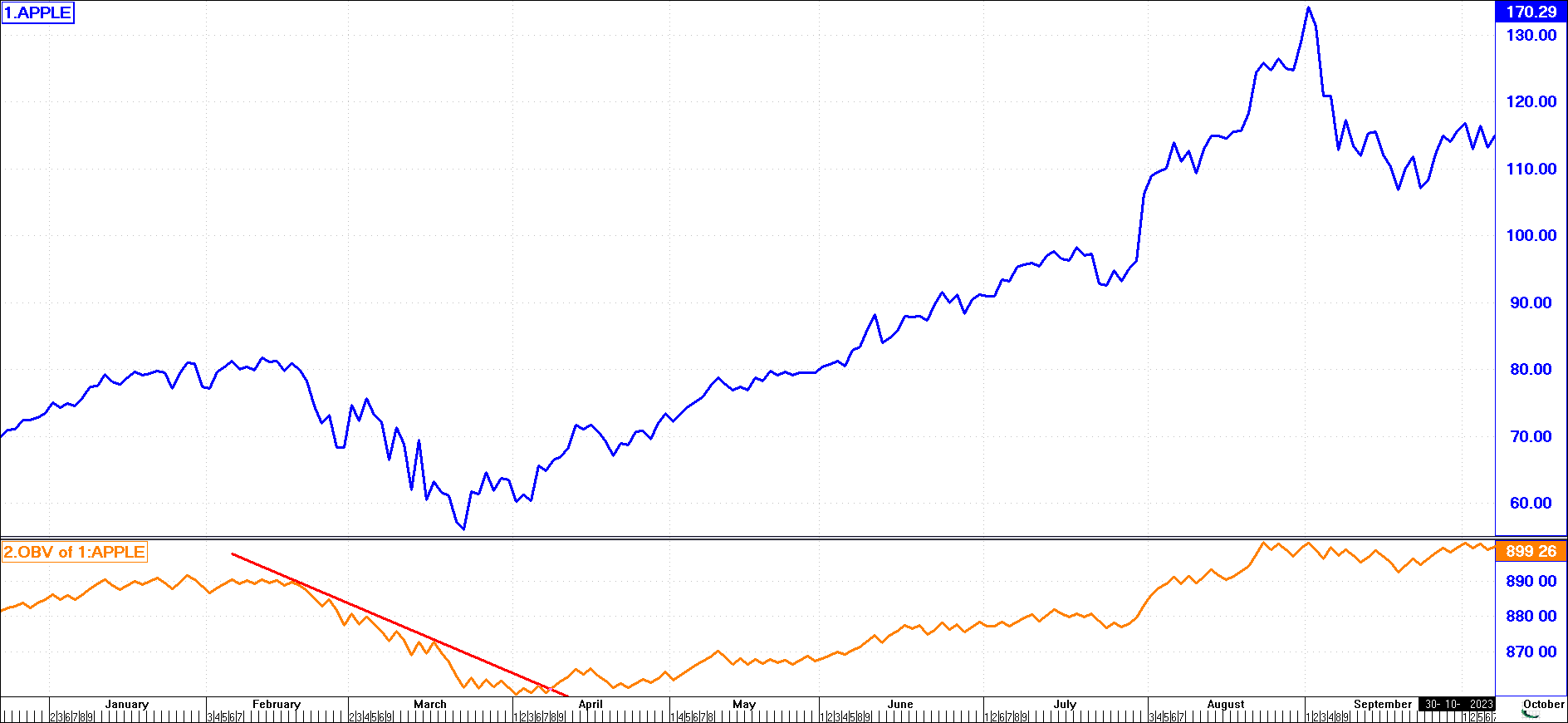
Any sharp uptick in the graph is read as a buy signal. A sharp downtick is a sell signal - meaning that a sizeable number of shares were traded on a day when the share price dropped, showing that investors were dumping shares onto the market in an effort to sell. In the chart, it can be clearly seen how the OBV broke up strongly at the end of March, well before the price rallied in April.
A major criticism of OBV is that it does not show up sharp rises or falls in price, only those in volume. It has also been argued that profits are made on price, not volume, and therefore one should not pay too much attention to volumes. However, the OBV has frequently provided an early warning signal of a price rise to follow.
Overbought/Oversold (OB/OS)
There is often confusion about what is overbought/oversold. We use these terms as follows:
Overbought - this term is often used to describe a share whose growth prospects are considered good, and where market demand pushes the price to unrealistically high levels.
Oversold - this is the reverse of overbought. It is where investors try to sell their shares heavily on the market, forcing the price down to unrealistically low levels.
Overbought/Oversold - this is a type of oscillator which measures the percentage difference between the share price and a chosen moving average line. The moving average line is flattened out into a straight line and the share price graph is then superimposed. The object is to find points on the graph where the distance from the moving average line (now represented as a flat zero line) is at its widest and starts moving back to the zero line. This, all things being equal, would generate a buy or sell signal. The graph “oscillates” around the zero line and one looks for signals to buy and sell.
(click image to enlarge)
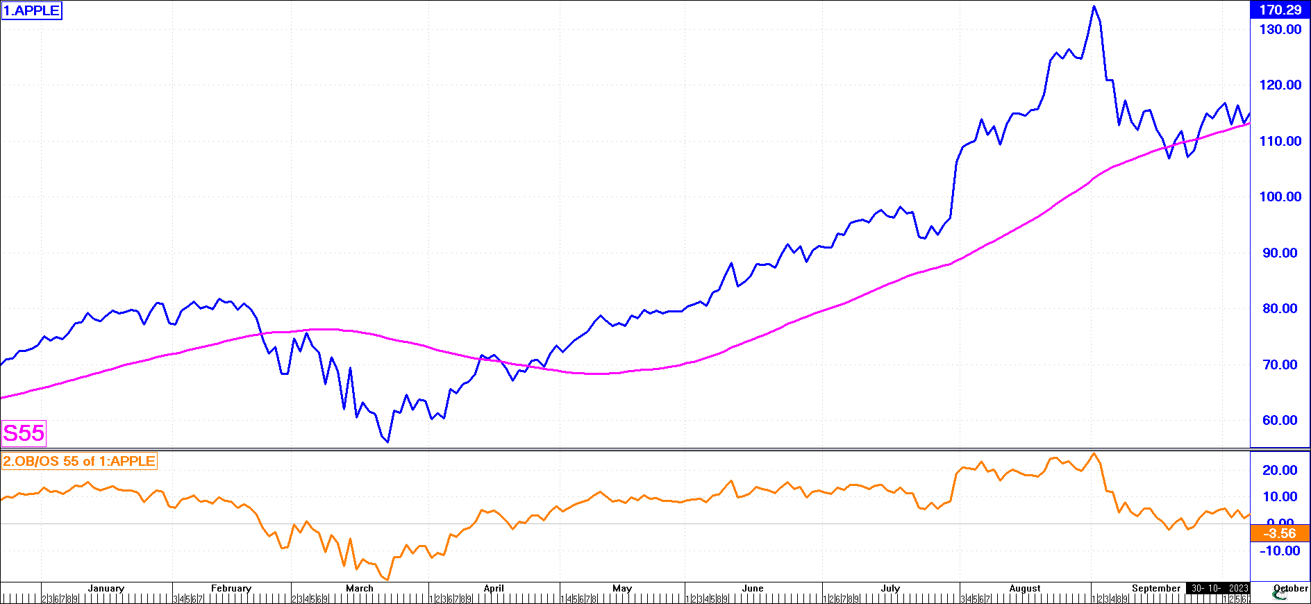
In the following example, we have taken a share price graph of Apple together with a 55-day simple moving average. Below this, we have printed a 55-day overbought/oversold graph.
Where the OB/OS graph drops below the 0-line, this means that the share price graph is below the moving average. If we consider the moving average line (i.e., the 0-line on the OB/OS graph) as the “true value” of the share, then a significant drop below this line represents a “bargain” or “below true value”. However, if the OB/OS graph continues to drop further below the 0-line, buying would be dangerous until it showed signs of reversing back towards the 0-line (or “true value”). We should therefore wait for an opportunity when the OB/OS graph is well below the 0-line but starting to move back towards the 0-line. This, all things being equal, is a buy signal.
(click image to enlarge)
However, what if the moving average line is in a bear trend? Looking at the graph opposite, it can be seen that buy signals from an OB/OS graph in such a situation are highly suspect because they are instructing you to buy the share when the overall trend is downwards. Although the market may rise, it is only a small rally and the general trend remains down.
So OB/OS is generally used only in a rising trend or where the share price graph has shown distinct signs of bottoming. One must never follow a buy signal on an OB/OS graph without referring to the share price trend. The accuracy of the buy signal can be verified by looking at previous buy signals (for example, where the OB/OS graph breaks upwards through the -10% line) and judge whether these were good signals in the past. If they were, then any breakups through the -10% line today can safely be considered a reasonable buy signal - remember, we are using past trends to figure out future movements in price. If the -10% line works on your current chart as a buy line, do not stick with this blindly forever. Patterns and trends change, and while -10% may have been a good buy line over the previous 12 months, today, -5% may be a better buy line.
OB/OS Indicator Patterns
(click image to enlarge)
This is clearly a subjective analysis, and one person may interpret a signal as a buy while another may ignore it.
All you can really expect from OB/OS is that it will identify patterns of price behaviour which will help you with your buy and sell decisions.
Relative Strength Index (RSI)
This indicator can be used to reveal the strength or weakness of a share’s trend and thus show investors whether there is still a demand for the share. It shows whether a share is overbought or oversold or somewhere in between.
Developed by J. Welles Wilder, Jr., this indicator has become one of the most popular to be used among futures and stock market traders. Wilder felt that a major problem with the construction of a momentum line using price differences was that often the price being dropped off at n number of days, had a dramatic change and therefore caused an erratic swing in the Momentum line, that needed some smoothing.
That is, a sharp rise or fall in the price n number of days ago can affect the current momentum line, despite a small movement in the current price.
Another problem that he identified was the need for a constant band for comparison purposes. He solved this by creating a constant upper and lower boundary within the vertical range of 0 to 100.
Formula: RSI = 100 - [100/(1+RS)]
Where: RS = Average of n day's up closes / Average of n day's down closes
NOTE:
The Relative Strength Index is entirely unrelated to the Relative Strength Line (which is the "price" of one share or index divided by the "price" of another - where the "strength" of one is divided by the other and expressed as a ratio).
The Relative Strength Index measures the internal strength of a selected security. That is, the RS in the RSI formula, is the average price rises divided by the average price falls over n number of days - where the ratio of upward/downward pressure on a share's price over n number of days is expressed as a percentage.
(click image to enlarge)
One should watch for a break below the 30% line - when the graph reverses up through 30% which is generally considered a buy signal. RSI works particularly well for sell signals. When the graph is above 70% and reverses down through this line, this could be interpreted as a sell signal.
When the graph is between 30% and 70%, any signal or reversal in the graph would tend to give a weaker signal. So the analyst should watch for a situation where the graph rises above 70% or falls below 30% - any reversal across these lines would give stronger signals.
Remember!
| • |
The shorter the time period, the more sensitive the RSI Indicator becomes and the wider its fluctuations.
|
| |
| • |
The RSI is said to be in O/B territory when above the 70 zone, in an uptrend, and in O/S territory when below the 30 zone, in a downtrend.
|
| |
| • |
Divergence between the RSI and the price line, when the RSI is in the "extreme" above 70 or below 30 zone, is a strong signal that should not be ignored.
|
| |
| • |
Failure Swings: occur in the "extreme zones".
A Top failure swing occurs when the RSI line fails to exceed a previous Top in an uptrend, followed by a downside break of a previous bottom.
A Bottom failure swing occurs when the RSI line fails to penetrate below a previous Bottom, in a downtrend, followed by an upside break of a previous top.
|
| |
| • |
Various chart patterns can at times be distinguished. They are valid as confirming factors to the price chart.
|
| |
| • |
Support and resistance levels show up. Use them.
|
| |
| • |
Trend line Analysis on the RSI is a valuable tool in conjunction with the price line. If there is divergence, it constitutes a serious warning of change.
|
Stochastic
(click image to enlargen)
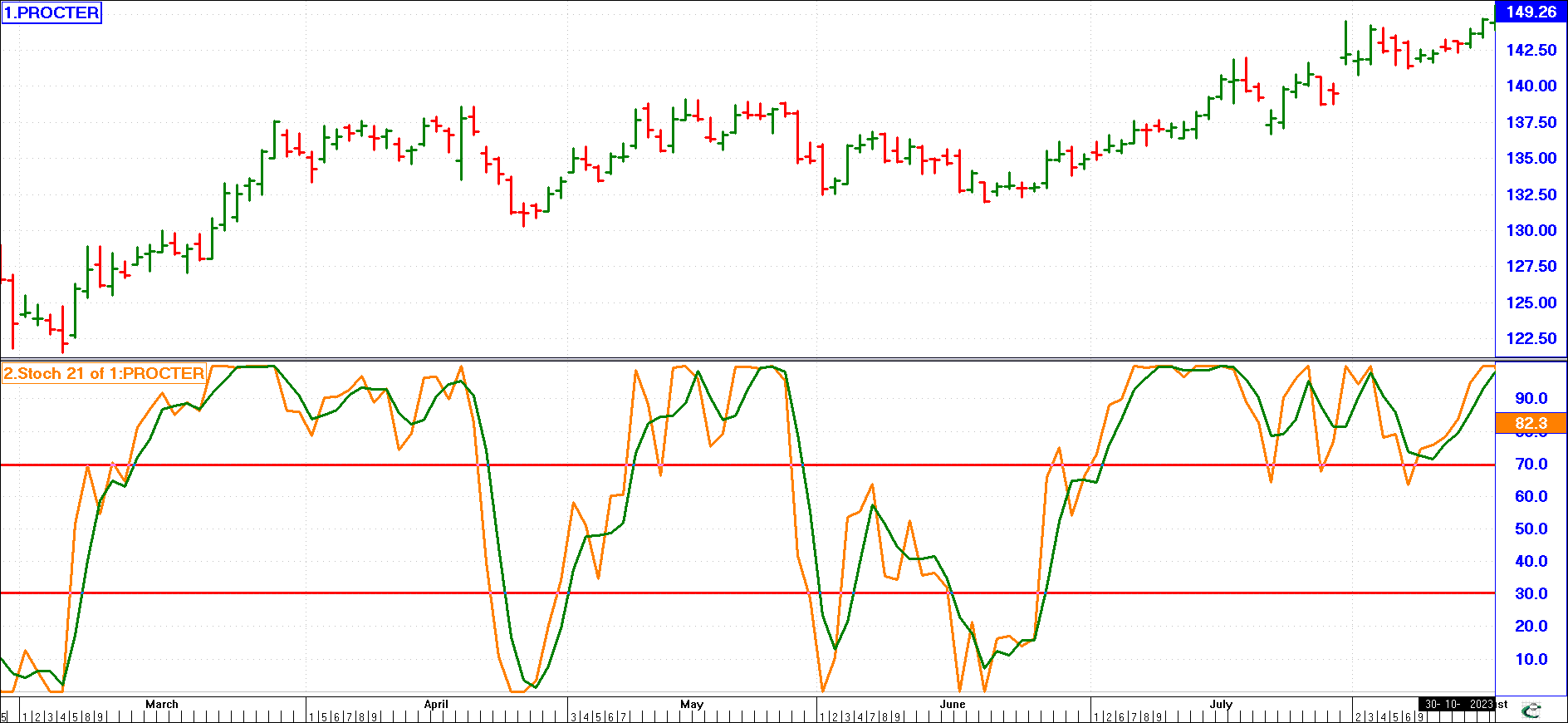
Stochastic is a process governed by the laws of probability. George Lane developed the Stochastic Oscillator based on the observation that as prices accelerate, so the closing prices concentrate towards the highest or lowest range of the day, dependant on the direction of the acceleration.
In other words: In an uptrend closing prices tend to be near the day's high, in a downtrend closing prices tend to be near the day's low.
Two lines oscillate between 0 and 100 - the %K and the %D - the K line is a solid line and the more volatile, while the smoother D line is a dotted line. The most important signal to watch for is a divergence of the D line to the price line.
Formula: %K = 100 [(C - Ln)/(Hn -Ln)]
Where :
C = Latest closing price
Ln = Lowest low in n days
Hn = Highest high in n days
The %D line is a smoothed version of the %K line.
There is also a slowed version or the Slow Stochastic, which uses the %D line of the Regular Stochastic as the solid line or %K line. The %D line is then a further smoothing.
Remember!
| • |
Buy signals work best in up trends. |
| • |
Sell signals work best in downtrends. |
| • |
When the %K + %D lines have fallen below 20 and bounced near 5 to 15 and the %K crosses the %D on the up, a buy is triggered in an uptrend. |
| • |
If prices are non trending the stochastic is useful if it shows sufficient amplitude. |
| • |
Look for divergence. |
Momentum (Rate of Change)
(click image to enlargen)
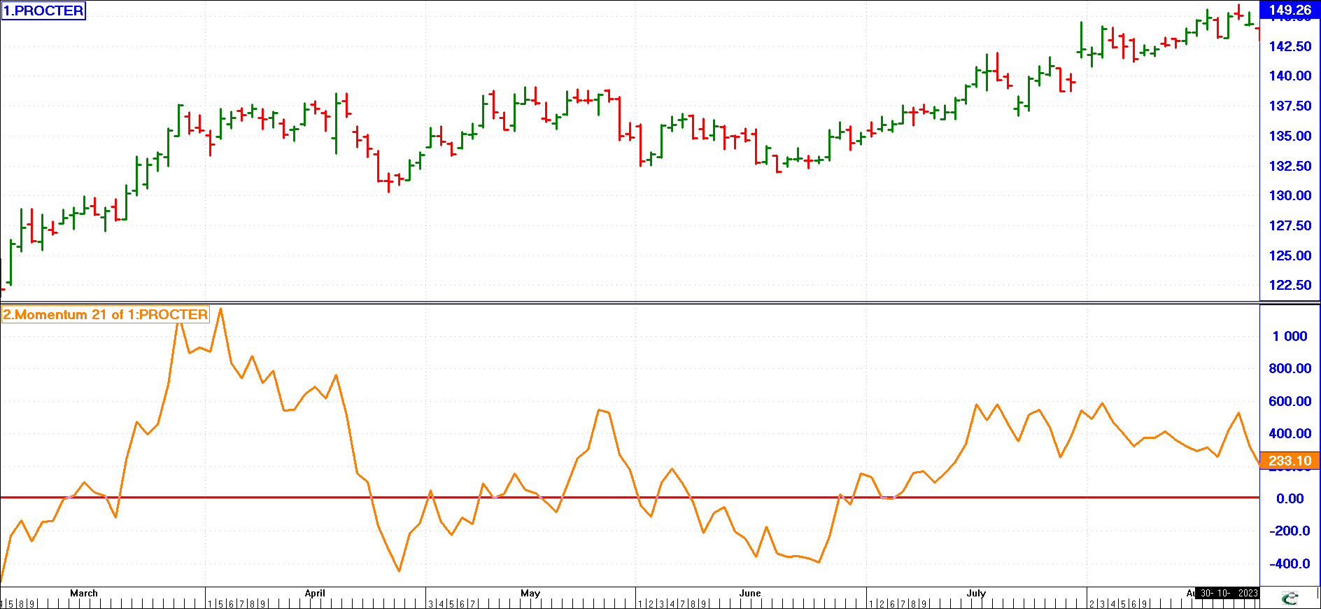
The momentum indicator, like OB/OS, is an oscillator (it oscillates around a 0-line) and it measures the rate at which a share price is changing. It does so by comparing the current price against its value a given number of days previously. One has to decide what period you wish to select before you can calculate this oscillator.
When the graph is at zero, this tells us that the share price on the day is exactly the same as it was 34 days previously (in the chart we are using a 34-day momentum). When the graph is at +10%, this tells us that the share price on that day is 10% higher than it was 34 days previously. If the momentum graph was a straight line at +10%, this would tell us that the share price is rising by a steady 10% every 34 days. Obviously, this is very unlikely to occur - what usually happens is that the momentum, or rate of change, accelerates and then slows, accelerates and then slows again. We must look for opportunities where the momentum is well below - 10% and wait until it starts to accelerate again, reversing up through the -10% line. This would, generally speaking, generate a buy signal.
Similarly, when a momentum graph is above the +10% line and reverses down through this line this may be considered a sell signal. One must first choose a good period with which to work. If you have chosen a 21-day moving average and/or OB/OS indicator period, then you should also work with a 21-day momentum. Look for patterns in the graph - if a breakdown through +20% gave a good sell signal in the past then this can be considered a good sell signal now. If a breakup through - 10% gave a good buy signal in the past then this can be considered a good buy signal in the present.
If the graph is +30%, this means that the share price is higher than it was 21 days (or 34 days, or whatever period is chosen) ago, but when it starts to move down towards zero, the share price is still moving upwards. However, it is not moving up as fast as it was. This generally tells us that the momentum will decline and the share price will soon start falling. In the same way, when the graph is at -20% and starts to move upwards, this tells us that the share price is still falling compared with say, 30 days ago, but that it is falling less rapidly.
The theory behind momentum is like throwing a ball high into the air. It gradually slows down before dropping back to the ground. The technical term for this slowing-down phase is a “loss of momentum”. The same phenomenon is frequently observed in a rising stock market - shares or indices gradually lose momentum prior to reversing direction. Measuring this momentum change by dividing the closing prices of those recorded at a chosen previous period is then possible. You will very seldom find a share price dropping from 1000 cents to 100 cents, without trading at the various stages between. This means that following your sell signals, you will generally always find enough time to sell a share before it drops significantly (assuming that the share has a ready market, i.e., that it is heavily traded).
Exponential Oscillator
This indicator can be used for long term investment as well as short term trading decisions.
Three different trading methods can be used with the Exponential Oscillator. Each of the different methods will yield different results and no single method will give the best result for all shares (on average, the moving average crossover method yields good results). You need to find the method and periods that are best for each share you are interested in.
(click image to enlargen)

Cross-Over
When a moving average of a given period intersects the indicator, buy and sell signals are given. As the Moving Average goes below the indicator, you Buy, as the indicator goes below the Moving Average, you Sell. The chart shows a 13, 34-day Exponential Oscillator and a 34-day Moving Average. The buy signal is in early June at 6008 with the sell coming in mid-August at 7890 - a 30% trade in 10 weeks.
(click image to enlargen)
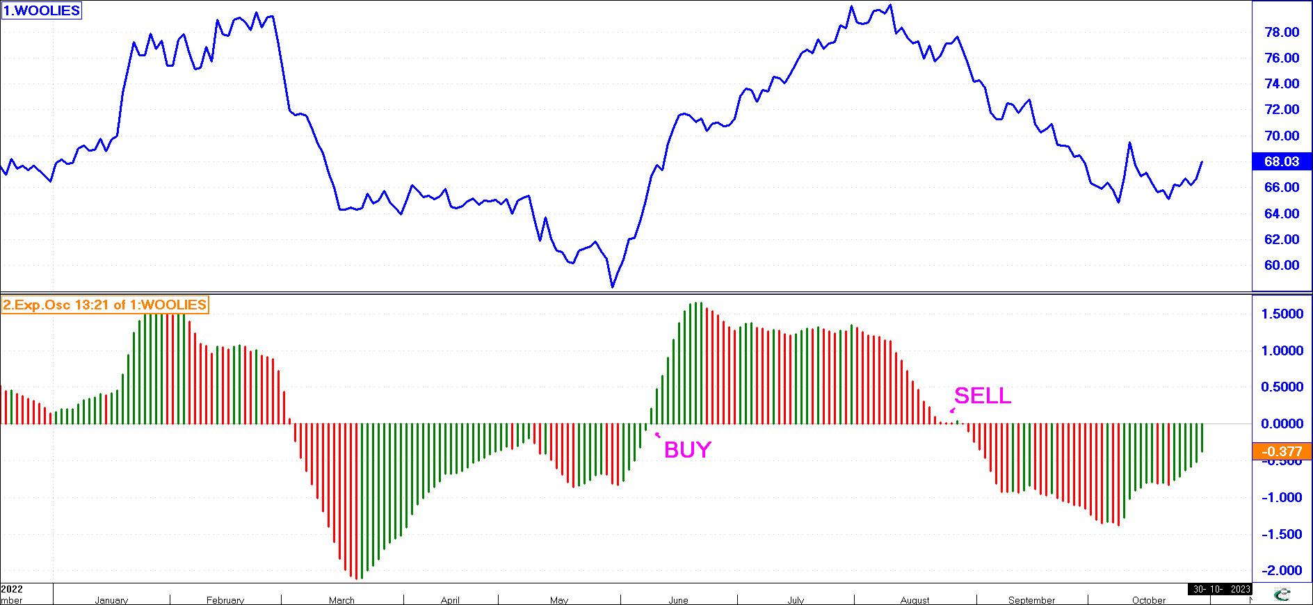
Direction Change
You buy and sell as the indicator changes direction. If the indicator is going down, and then turns up, you buy. If the indicator is going up, and then turns down, you sell.
Zero Crossing
You buy and sell as the indicator crosses the zero line. If the indicator is above the zero line, and then crosses below the zero line, you sell.
Conversely, if it is below the zero line and crosses above it, you buy.
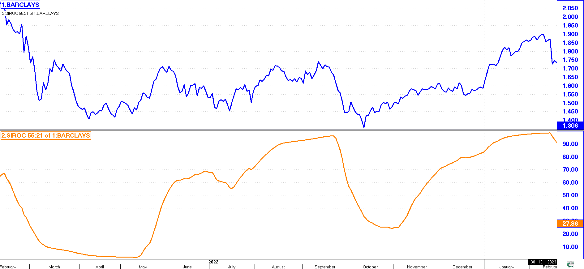
SIROC
The SIROC (Smoothed Indexed Rate Of Change) Indicator can be used for medium-term investment as well as short term trading decisions.
The SIROC can be used to give well-defined buy and sell signals in markets that move cyclically. If insufficient smoothing is used, it may not provide good signals during medium/long-term investments. If you are interested in short-term trading, the SIROC indicator gives good results, provided you use another indicator (such as the Exponential Oscillator) to show the current trend. This is needed as the SIROC may give incorrect signals if a normally volatile market changes and moves for long periods of time in a single trending direction.
Two periods are needed to define the SIROC indicator. The first period defines the rate of change. The second period defines how much smoothing to be used. Usually the second period is smaller than or equal to the first period. Values of 5, 8 or 13 seem to work well for the second period.
Three different trading methods can be used with the SIROC. Each of the different methods will yield different results and no single method will give the best results for all shares (on average, the moving average crossover method yields good results). You need to find the method and periods that are best for each share you are interested in.
Usually, users will use a combination of all three methods. If you have selected your periods correctly, you have noted the general trend of the market, then buying when the SIROC is low and selling when it is high will provide profitable results.
(click image to enlargen)
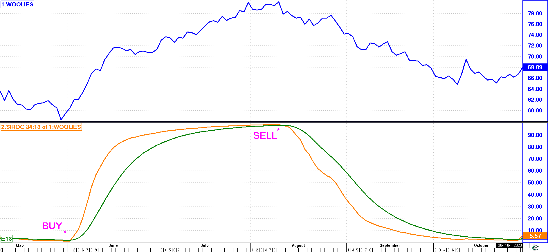
Cross-Over
When a moving average of a given period intersects the indicator, buy and sell signals are given. As the Moving Average goes below the Indicator, you buy, as the Indicator goes below the Moving Average, you sell.
Sometimes, the crossover method may not have yielded profitable results. You would use other indicators during this period to figure out what is the general trend, and thus would not act on any of the SIROC's signals that go against the trend.
(click image to enlargen)
Direction Change
You buy and sell as the Indicator changes direction. If the Indicator is going down, and then turns up, you buy. If the Indicator is going up, and then turns down, you sell.
Many traders may note a direction change as a signal that the market is changing direction, and then only act when a given moving average intersects and confirms the direction change. This would have helped eliminate the number of minor direction change signals that you would not have wanted to act on this chart.
(click image to enlargen)
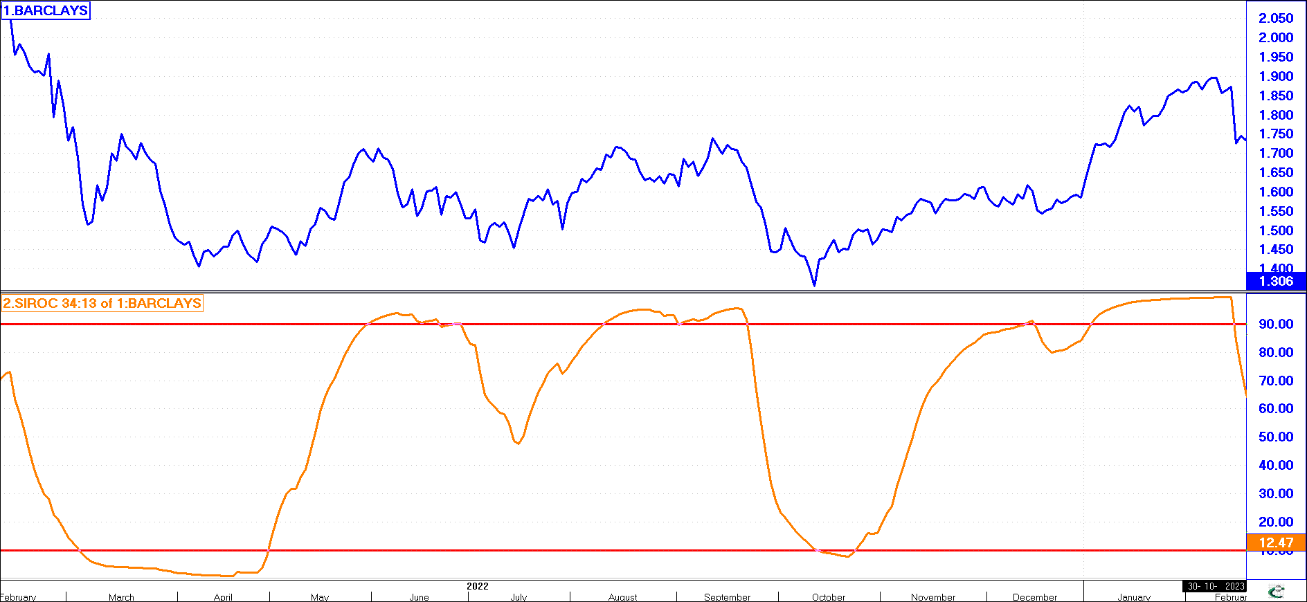
Limits
Like the direction change method, you buy and sell as the indicator changes direction provided it has exceeded a given level or the current move since the last reversal has exceeded a given limit. Only then, if the Indicator is going down, and then turns up, would you buy. Conversely, only if the Indicator is going up, and then turns down, would you sell.
This method will allow you to identify the bigger moves. The market has moved in the given direction long enough for the SIROC to have exceeded a given level (eg. above 90, below 10 or moved more than 60 points, etc.). The market is thus extended and you then feel confident that as the SIROC changes direction, the major reversal has occurred and you therefore don't need to wait for confirmation from a moving average.
Note how in the previous example, you would only act if the SIROC changed direction above the level of 90 or below the level of 10. In addition, if a reversal occurred after a substantial move by the SIROC the signal was acted upon. Minor reversals are ignored.
Relative Strength
(click image to enlargen)
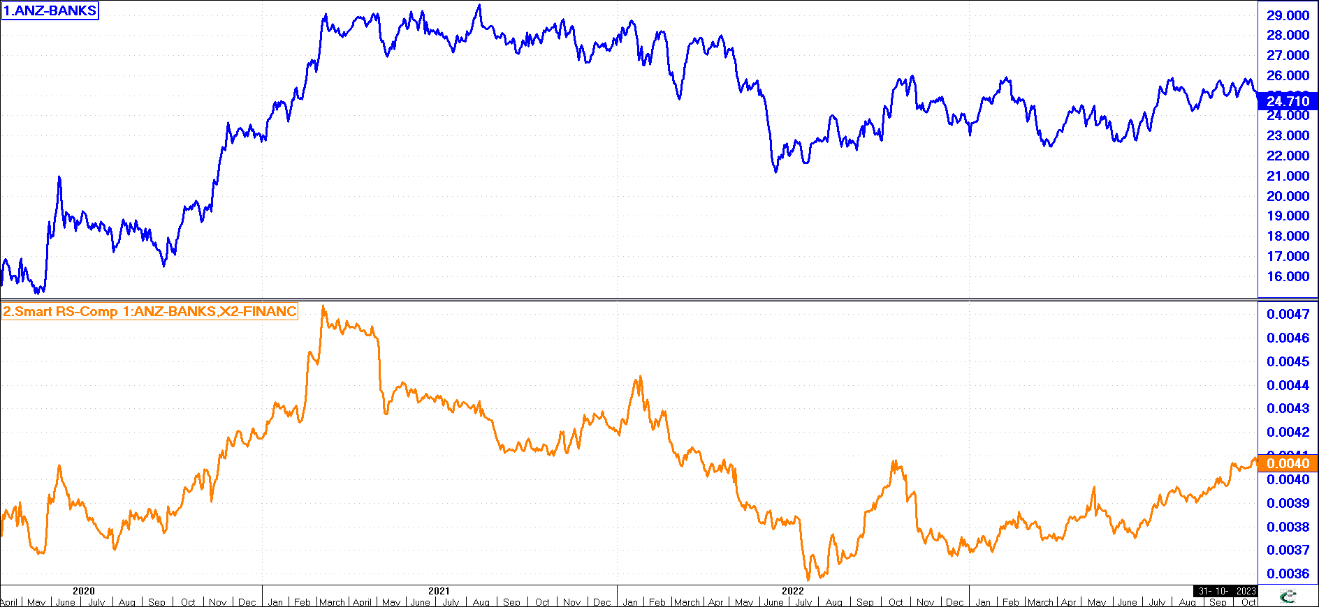
This indicator is not to be confused with the Relative Strength Index (RSI) indicator.
RSI measures the upward movements in price with the downward movement over a preselected period.
Relative Strength, as the name suggests, measures the strength of one share (or graph) compared with another. It is a simple index to calculate. If we want to measure the Australian and New Zealand Banking Group (ANZ-BANKS) share price compared with the Financial Markets Index (X2-FINANC), we simply divide the share price on anyone day with the index for that day. The result will be a ratio. The size of the ratio is unimportant - it is the trend of the graph and its rate of incline or decline that counts. The top graph is the Share price of ANZ-Banks and the bottom graph is the Relative Strength of ANZ-Banks compared to the X2-FINANC Index.
Relative strength is used to compare the rate of the increase of one share relative to another, or more generally, the rate of the increase of a share compared with its index (which represents the average for the sector). For example, where two graphs are rising sharply, one may be uncertain which share to invest in - using relative strength, one can determine which of the two shares is rising fastest.
In the previous example, although ANZ-BANKS (and most other Financial shares) were rising from mid-2020 into early 2021, ANZ-BANKS was rising faster than all other Financial shares on average (ie. The X2-FINANC Index represents the average performance) as the relative strength graph is going up.
During the period March 2021 to July 2022, although the graph of ANZ-BANKS was moving sideways to down, in actual fact ANZ-BANKS performed worse than most other Financial shares as its relative strength was declining. Thus although during this period 2020 to 2022) the Financial market (and ANZ-BANKS) rose and fell, when it rose, ANZ-BANKS rose more than most others, and when moved sideways and started to fall, ANZ-BANKS actually fell further.
From March 2021 to July 2022, ANZ-BANKS was not the Financial share to be in - on average, any other Financial share would have been better. However, from July 2022 onwards, ANZ-BANKS is performing better than the average Financial share and thus a better option if you wish to invest in Financial stocks.
Frequently the Relative strength ratio will start turning before the price. It can often be used as a leading indicator of possible trend reversals. Note how the relative strength peaked and then fell sharply in March 2021 giving ample advanced warning to take profits after the 90% rise of the previous 10 months. Use relative strength graphs along with trend lines to establish when and where this may happen.
Having now gone through the various main indicators used in technical analysis, you are ready to analyse shares and time your purchase or disposal thereof.
However, before you rush off to do so, it would be good to first understand how the economy of a country ties together. The current economic climate will affect the stock market and its potential direction. This will impact on most shares in general.
You would thus want a basic understanding of the economy to decide if you should be investing, holding or selling. Although the current economic climate may not impact on every share in the market, you would be foolish to disregard totally or ignore its effect. Lesson 5 will give you this basic understanding.
(You can also obtain this Lesson as a PDF document from our Services Menu, or click here)