Lesson 7 - Point & Figure Charting and Wave Analysis
(To obtain this as a PDF document click here)
Point and Figure Charting
This method of charting has been in use since around the year 1880 and was given the name "book method" by Charles Dow in one of his editorials in the Wall Street Journal around 1901. The name "Point and Figure" was only used as late as 1933 by a man called Victor deVilliers.
Introduction to Point and Figure Charting
Point and Figure charting is an extremely complex subject so we'll begin by looking at some differences between Bar charts and Point and Figure charts:
Bar Charts
Bar Charts are constructed using the highest price traded for the day and the lowest price traded for the day in a vertical line, with a horizontal dash on the vertical line to denote the closing price for the day. It is plotted at specific time intervals (daily, weekly, monthly etc.) no matter whether there is a change in price for the subsequent times or not. That is, no change in the price for the following day would be reflected by using the closing price of the previous day and representing it as a dash - no high and no low. So, the bar chart combines both price and time. That is, the vertical axis is the price scale and the horizontal axis is the time scale. The daily (or weekly, or monthly etc.) price action moves one space or bar to the right on each successive day (week, month etc.), even if there was no change in price for the day. So something always has to be placed in the next space for the next trading period. In other words, Bar charts give a one-dimensional view of price action.
Point and Figure Charts
In Point and Figure Charts only the price changes are recorded, so that if no price change has occurred, no plotting is done. However, much plotting may be required when there is considerable market activity...
First, the size of each box must be determined. The smaller the box size the more the trading activity is detailed and the larger the box size the less the detail of price movement. So, to decide the size of the box it is important to consider whether you're wanting to look at a short, medium or long-term view. The longer-term the chart, the larger the box size must be, otherwise the chart becomes too large and unwieldy.
Second, the type of Point and Figure Chart must be chosen (ie. a regular chart or a reversal chart). In the regular chart, each price change is recorded, whereas in the reversal a new series of X's or O's cannot begin until prices have moved by a specified amount in the opposite direction to the prevailing trend.
Although volume is not recorded under the Point and Figure chart, volume activity is not totally lost as heavier or lighter volume is reflected in the amount of price changes recorded on the chart.
The original type of Point and Figure charts used were intra-day charts. The intent was to record each “one point” move of the stocks under consideration on paper, the aim being to find a way of "fine-tuning" the detection of accumulation and distribution. Only whole numbers were used and each "box" was assigned the value of one point. Each one-point move in either direction was recorded.
Today, it is more common to vary the size of the box according to the value of the stock under consideration and according to the sensitivity the chartist wishes to obtain.
As with the values, the reversal size can also be changed. The reversal criterion means the number of boxes that the price of a stock must retrace before it is filled into the next column on the right. The most popular reversal size is the three point reversal, which means that the price reversal must be equal to the value of three boxes before the boxes are filled.
The size of the box and the reversal size then, are the only ways in which the Point and Figure chart can be varied.
For the very short-term trader, mostly in the futures arena, where intra-day trading is often the order of the day, the one point reversal is the most useful. The most popular reversal criterion is the three point reversal, which is most used for the study of the intermediate trend, and the five point reversal is used for long-term trends because of its severe condensation.
Constructing a Point & Figure Chart
The choices you make regarding the box size and the reversal size are essentially based on personal judgement. Commonly, a box size of about 1% is a good starting (and often ending) point. Thus, if the current share price is 1000, you would use a box size of 10. Every time the share moves up by 10 cents, an X is plotted, and every time it moves down by 10 cents, an O is plotted. If the share moves up by only 9 cents, no X is plotted—it must move by a full 10 cents before marking an X.
The whole object of the Point and Figure chart is that it smooths out minor fluctuations in the graph so that only major trends are reflected.
In addition to selecting a "Box" size, a "Reversal" size must also be selected.
The "reversal" is an additional smoothing tool in Point and Figure charting.
If a reversal of 3 is selected, this means that when the share price has been rising and starts to fall, O’s are only plotted when the price has fallen by 3 times the box size (e.g., 30 cents).
Choosing Box and Reversal Sizes
(click image to enlarge)
As a technical analyst, you must decide on the best "Box" and "Reversal" sizes to provide the clearest picture of the share price trend.
Most chartists prefer to use the 3-point reversal, which is a good starting point.
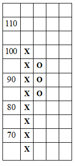
In the chart shown here, a box size of 5 (each X or O represents a price move of 5 cents) and a 3-box reversal are used.
The price of the share has gone up to 100 cents (the first vertical column on the left).
The price may have gone up to 101, 103, or even 104 cents, but it did not reach 105 cents (otherwise another X would be plotted at 105).
If the price declines to 85 cents (or lower, but not as low as 80 cents), a 3-box reversal takes place.
The uptrend that was in place is considered broken. A downtrend begins, denoted by a row of three O’s in the second vertical column.
Reversals and Trends
(click image to enlarge)
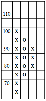
If the price of the share declines to 80 cents, another O is added as shown here.
The downtrend remains in force until the price reverses up by at least 3 times the box size (e.g., 3 x 5 = 15 cents in this example).
If the price falls to 75 cents (or lower, but not as far as 70 cents), the chart resembles the second column with 5 O’s.
Once the price rises to 90 cents (i.e., 15 cents above the plotted low of 75 cents), the downtrend ends. The chart then depicts the new uptrend with the 3 X’s as shown in the 3rd column.
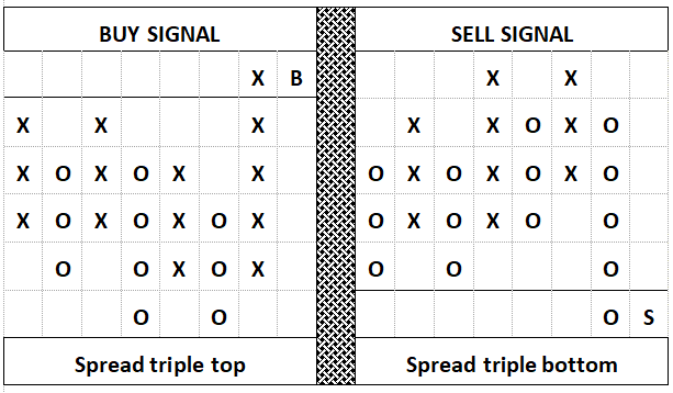
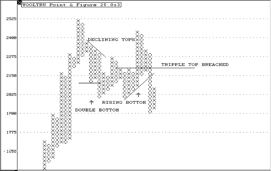
Interpreting the Point and Figure Chart
There are a variety of formations to look for in a point and figure chart.
(click image to enlarge)
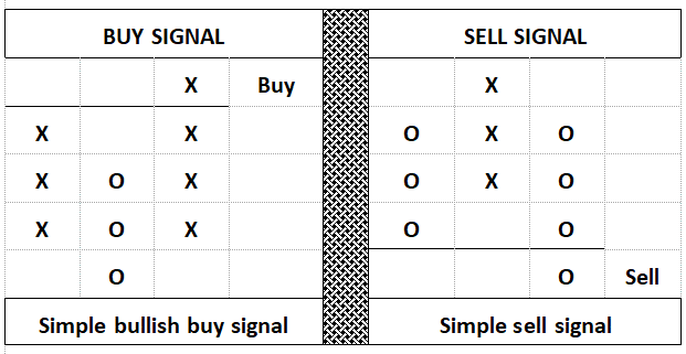
Simple Buy and Sell Signals
The previous examples of how to plot a Point & Figure chart demonstrate the simplest of buy and sell signals that can be obtained.
We recap them below along with more complex signals.
All that is required for the simple buy and sell signals is three columns, with the second column of X's moving one box above the previous column of X's to generate the buy signal, or the second column of O's moving below the previous column of O's to generate the sell signal. This represents a simple breakout through resistance or support.
(click image to enlarge)
Bullish and Bearish Patterns
In the bullish pattern, both the tops and the bottoms are ascending.
In the bearish pattern, both the tops and bottoms are descending, making this a stronger pattern than the previous examples.
(click image to enlarge)
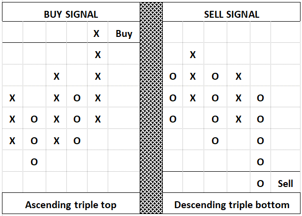
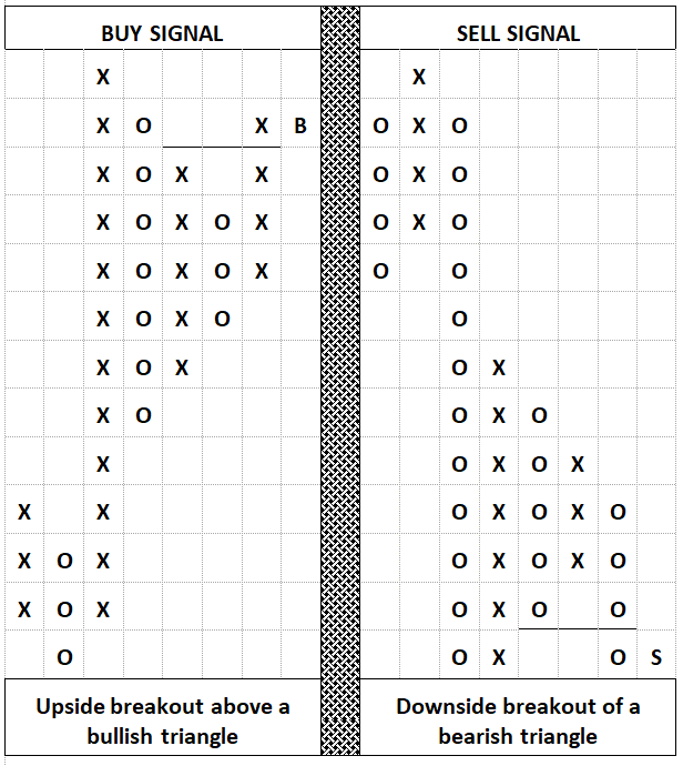
Stronger Patterns
This pattern is even stronger because there are seven columns.
Three columns of X's are exceeded on the upside breakout, and three columns of O's are exceeded on the sell.
|
(click image to enlarge)
Combined Signals
This pattern combines two signals:
- A simple buy signal must be present.
- The upper trend line must be cleared for the buy signal.
For the sell signal, the opposite holds true.
(click image to enlarge)
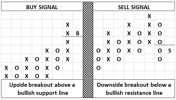
Advanced Breakout Patterns
Two things must happen here:
- A buy/sell signal must already have been given.
- The upper channel line must be completely cleared on the upside breakout, or the support line on the downside breakout.
|
(click image to enlarge)
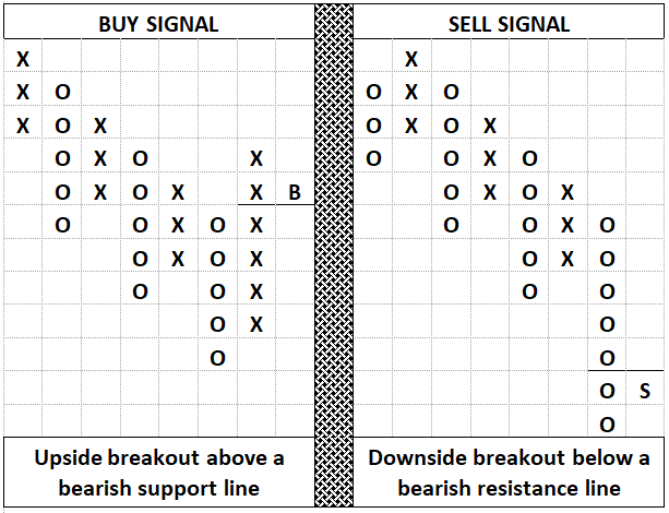
Bearish Breakout Patterns
A simple buy/sell signal must already have been given, combined with the clearing of the bearish resistance or support line.
|
Key P&F Points:
- The simple bullish buy or sell signal is a part of each complex formation.
- The formations, as shown, become increasingly stronger.
- The wider the base of the formation, the greater its upside or downside potential.
- There is a difference between how these patterns are applied to commodity markets as opposed to common stocks. However, the complex patterns are more common in stock market trading.
- Simple patterns need not be heeded when looking for entry into the market, but when they move in the downward direction, they should not be ignored.
- By varying the box and reversal sizes, these charts can be adapted to suit almost any need.
Drawing Trend Lines on P & F Charts
(click image to enlarge)
In intra-day charts, trend lines are drawn in the conventional way.
However, not so in the three-point reversal charts. Here they are drawn at a 45-degree angle and do not necessarily have to connect tops or bottoms. This is due to the condensed nature of these charts. Horizontal lines (i.e., 180 degrees) can be used to emphasize double/triple tops and bottoms.
Basic Trend Lines
There are two basic types of trend lines: the basic bullish support line and the basic bearish resistance line.
- In an uptrend, the bullish support line is drawn at a 45-degree angle upwards to the right from under the lowest column of O's. A breakout through the bullish support line constitutes a sell signal.
- In a downtrend, the bearish resistance line is drawn at a 45-degree angle downwards to the right from the top of the highest column of X's. A breakout through the bearish resistance line constitutes a buy signal.
These trend lines can be redrawn as needed, depending on price movement. The 45-degree angle is a guideline, not a strict rule.
Point & Figure Channel Lines
Channel lines are drawn parallel to the basic bullish support or bearish resistance lines. In an uptrend, the channel line is called the bullish resistance line; in a downtrend, it is called the bearish support line.
These lines are less reliable than basic trend lines and are used mainly as timing aids. They should not be used to take a position against the prevailing trend.
The Horizontal Count
The three-point reversal method allows for two measuring techniques: horizontal and vertical. The horizontal method works best when an upside breakout is preceded by a long period of accumulation, giving rise to a "horizontal base."
(click image to enlarge)
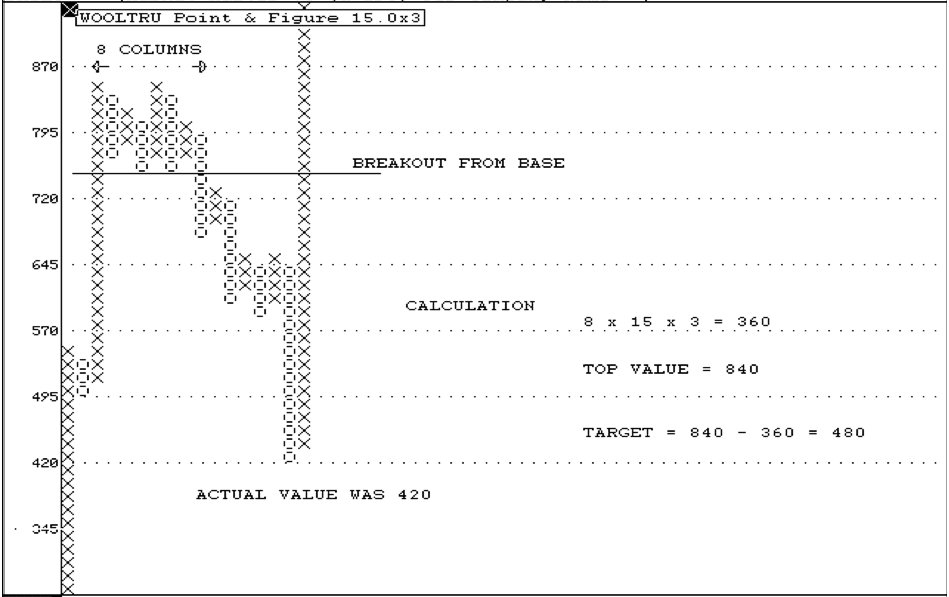
First, add the number of columns that form the base that the reversal broke out of. For example:
- The base consists of 8 columns.
- Using a 3 x 15 reversal and box size: 3 x 15 x 8 = 360.
- Subtract this from the highest value (840) to calculate the downside target: 840 - 360 = 480.
In this case, the market actually went down to 420.
Upside Target Calculation
(click image to enlarge)
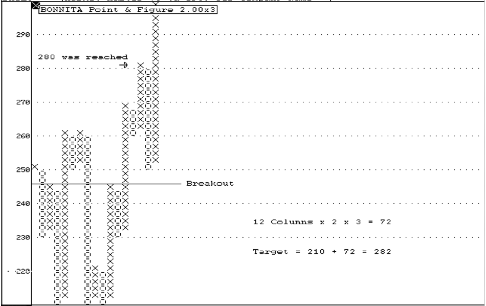
The same concept applies to calculate an upside target. For example:
- The base consists of 12 columns on a 2 x 3 Point & Figure chart.
- This gives a potential move of 72.
- The low in the base was 210, so the upside target is 282.
In this case, the market reached 280 before consolidating.
The Vertical Count
A vertical count is based on the general principle that the higher the first vertical row of Xs in an upside breakout, the higher the ultimate target.
(click image to enlarge)
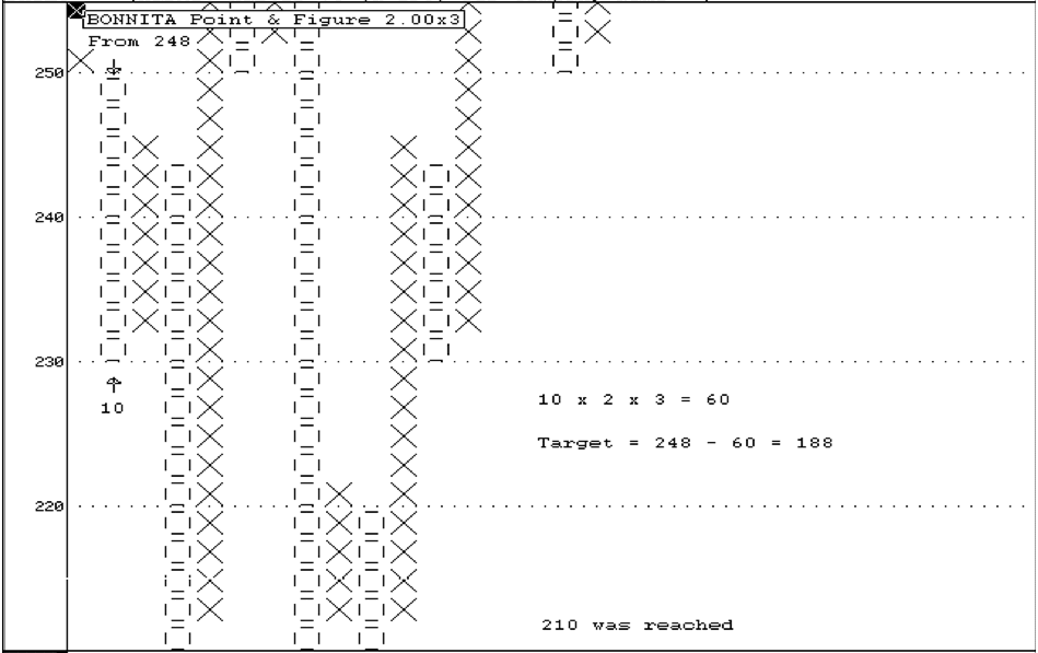
To calculate:
- Look for a breakout.
- Add the number of X’s (or O’s) in the first column and multiply by box size and reversal.
For example, in a 2 x 3 chart:
- The first column of the downside breakout started at 248 and has 10 blocks.
- Thus, the initial downside move is 10 x 2 x 3 = 60.
- Subtract this value from the highest value of the column to get the target: 248 - 60 = 188. In reality, a bottom of 210 was reached.
(click image to enlarge)
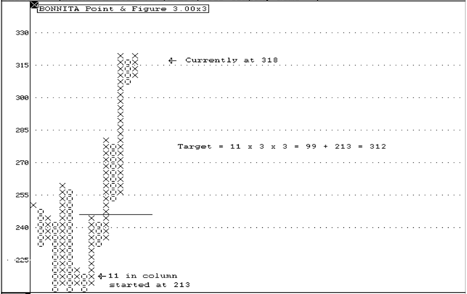
Similarly, on the upside:
- A breakout occurred in the opposite 3 x 3 chart after the first column (starting at 213) rose 11 blocks.
- Add this initial move of 3 x 3 x 11 = 99 to the start of 213 to get a target of 312.
- In reality, the market moved to 318.
Important Points
- Upside target calculations are more dependable when the general trend of the market is up.
- Downside calculations are more accurate when the general trend of the market is down.
- Investment decisions based purely on Point and Figure calculations are risky.
- The calculated target must be considered along with other technical and fundamental information.
- If both a vertical and horizontal count project a similar target, this is more dependable.
- There is no time limit for the target to be attained.
Wave Theory
The idea that history repeats itself has recurred throughout history, as man is surrounded by evidence of cycles: the 24-hour cycle of the sun, the 28-day cycle of the moon and tides, the annual cycle of seasons, and so forth.
Obviously, the cycles of the seasons have had a marked influence upon agricultural economies from ancient times. Hence, many people have tried to impose cyclic or wave theory upon other, far more complex economic models.
One of the first modern observers to apply cycles to economic events was a US farmer named Arthur Brenner, who published his “Prophecies of Future Ups and Dows in Prices” in 1875.
At the turn of the century, an American mathematician, W. D. Gann, was one of the first men on record to successfully apply cyclic theory to the stock market. However, perhaps the best-known advocate of "Wave Theory" was a Russian economist, Nicolai Kontratieff, who plotted economic history going back centuries and identified patterns of super-cycles of boom and depression.
Elliott's Wave Theory
(click image to enlarge)
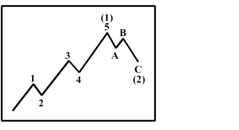
Ralph Nelson Elliott was the first to promote the concept that the stock market moved in a series of natural waves or rhythms.
He identified 5 waves in the direction of the main trend (impulse waves 1, 3, and 5) and corrective waves 2 and 4, followed by 3 counter-directional waves (the correction). This pattern was found to occur on both minute-to-minute and year-to-year bases.
The five graph points represent the changes in direction of the graph line—troughs and crests of minor waves within one big wave. Then, three downward moves occur within the down phase of the bigger wave.
Impulse and Corrective Waves
(click image to enlarge)
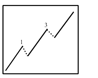
Elliott identified two types of waves:
- Impulse Waves: Move in the direction of the trend.
- Corrective Waves: Move opposite to the current trend.
In the five-wave move, there are three Impulse waves and two Corrective waves. Elliott noted relationships between the sizes of these waves, allowing accurate prediction of future moves once a wave pattern is identified. For instance:
- Wave 3 is typically 1.618 or 2.618 times the size of Wave 1.
- Wave 5 is either equal to or approximately 1.618 times the size of Wave 1.
Corrective Waves
(click image to enlarge)
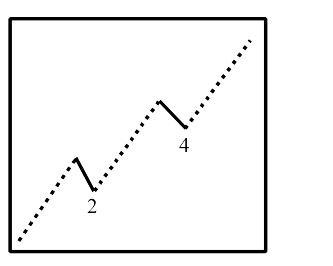
- Wave 2 cannot be longer than Wave 1 and is usually 0.618, 0.5, or 0.382 times the size of Wave 1.
- Wave 4 cannot overlap into Wave 1 and is usually 0.382 or 0.236 times the size of Wave 3.
- Wave C is either equal to or approximately 1.618 or 0.618 times the size of Wave A. It often ends 0.618 times the size of Wave A past Wave A.
|
Flat Corrections
(click image to enlarge)
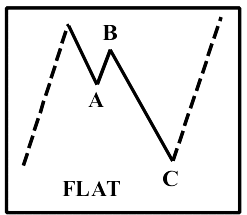
It is also possible for Wave A to equal Wave B, which equals Wave C.
Elliott Wave Variations
The Elliott wave does not always follow a uniform 5-wave bull formation. Elliott noted that “extensions” could occur at crests 1, 3, or 5. These lacked the elongated sub-waves seen in the diagram but often broke down into nine waves of approximately the same length.
Wave Characteristics
Wave 2 often manifests as a protracted sideways market, with its downside usually marking the highest support level. By the end of Wave 2, many investors are weeded out. Wave 3 is typically the longest and most profitable bull phase, characterized by strong volume and price movements. Extensions are commonly seen in this phase, and when Wave 3 is extended, Waves 1 and 5 are usually equal in time and size.
ABC Corrections
The ABC correction can occur during a bear or bull trend, serving to correct the previous trend. The characteristics of the waves are:
- Wave A: Often a minor correction ignored by the market.
- Wave B: Acts as a bull/bear trap, giving investors false confidence in a bullish trend.
- Wave C: Typically a sustained bear trend where investors sell off shares to protect their capital.
Market Cycle Insights
Joseph Granville observed that the three up-waves usually have similar time durations, followed by two shorter down-waves. He further noted that the average time from the beginning of one bull market to the next, on Wall Street, is four to four-and-a-half years—roughly three years up and a year to 18 months down. In the South African market, cycles tend to have varying lengths.
Application of Wave Analysis
(click image to enlarge)
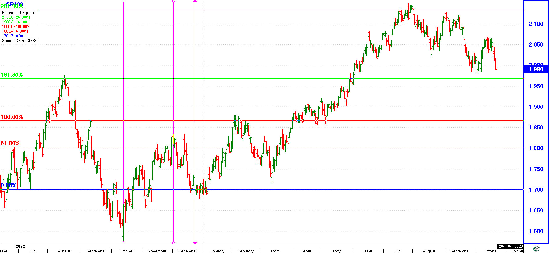
The following chart showcases the practical application of Wave Analysis as a technical analysis tool. Using data available up to December 2022:
- The first wave (October–November 2022) was identified.
- Its retracement (Wave 2) was observed in late December 2022.
- Based solely on this data, Wave Analysis predicted:
- The top of Wave 3 in February 2023.
- The pull-back of Wave 4 in March 2023.
- The market peak (Wave 5) in July 2023.
Happy investing, and always consider your charts—especially those waves!
(You can also obtain this Lesson as a PDF document from our Services Menu, or click here)